

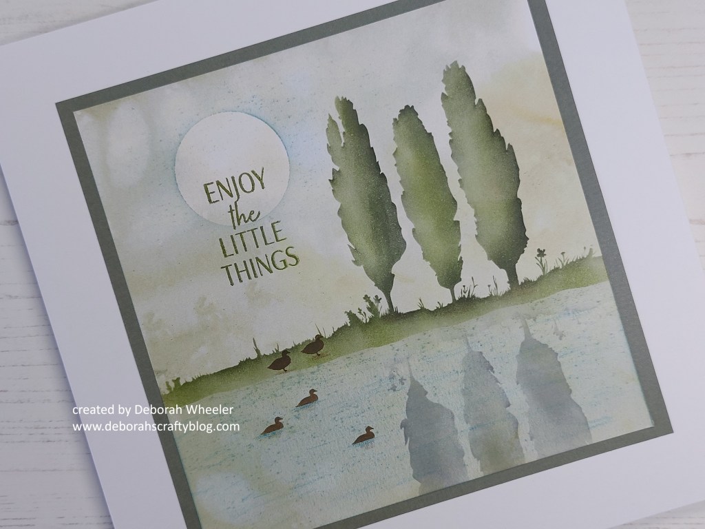
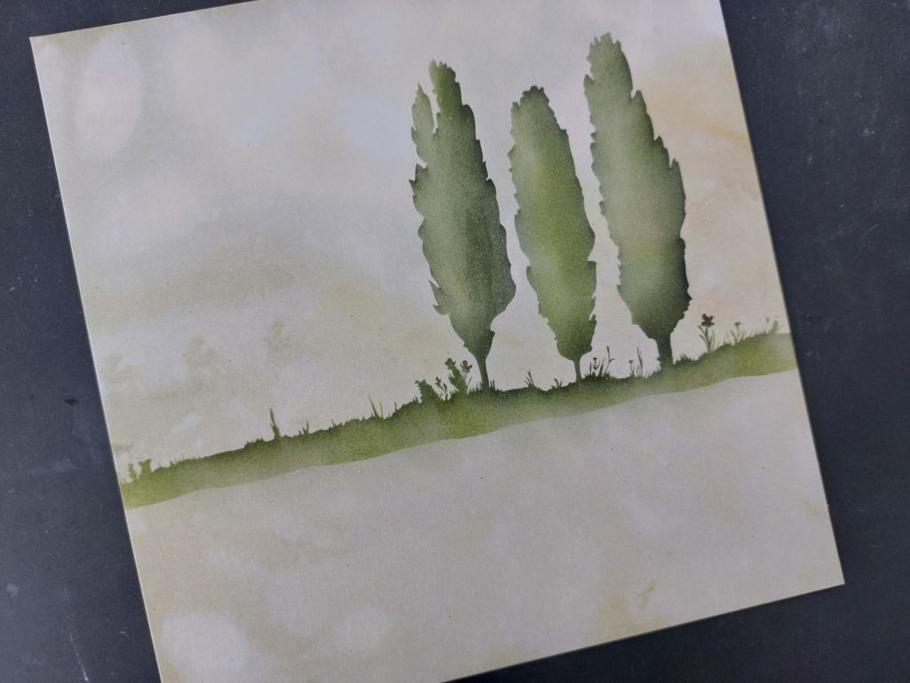
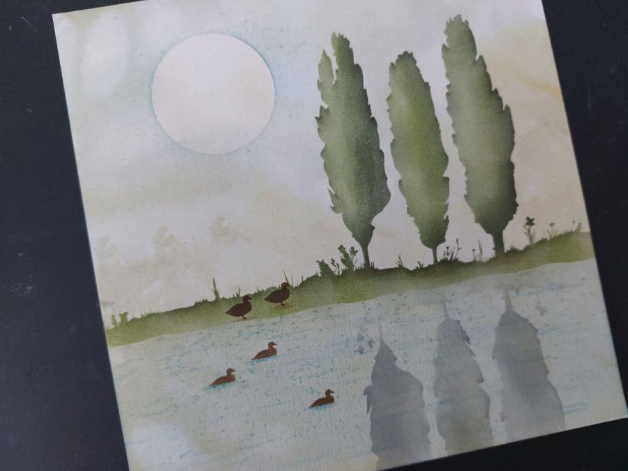
Hello everyone. I’m popping in with a second card today, from this afternoon’s Clarity Social TV show when I was busy playing with the Riverside Landscape masks collection. This is a larger card than I usually make (it’s an 8×8), but I wanted to take advantage of the reflection masks so needed space to fit both images in. I’ve used a piece of the Elements Earth A5 card for my background – there are some lovely greeny tones in the pack, one of which worked perfectly.
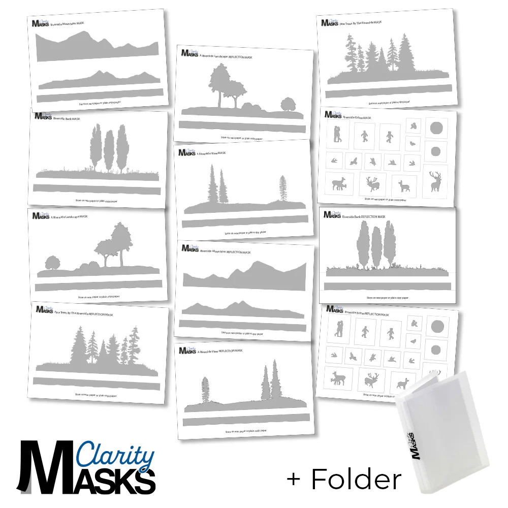
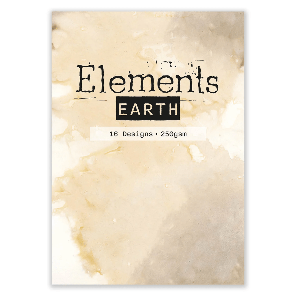
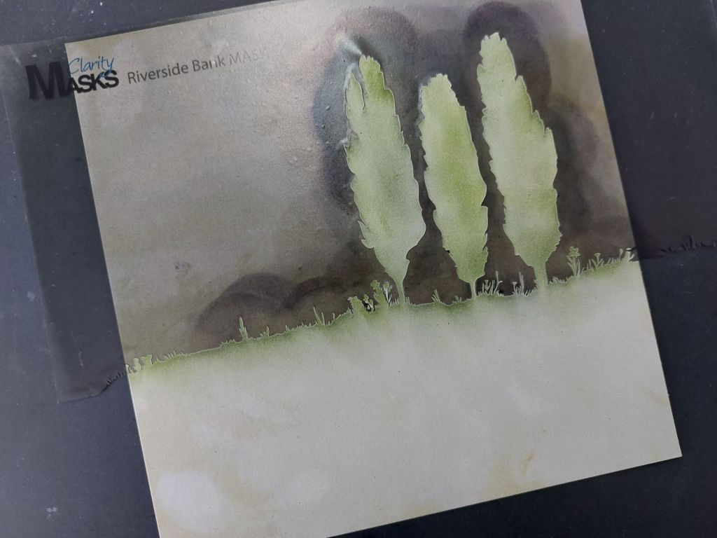
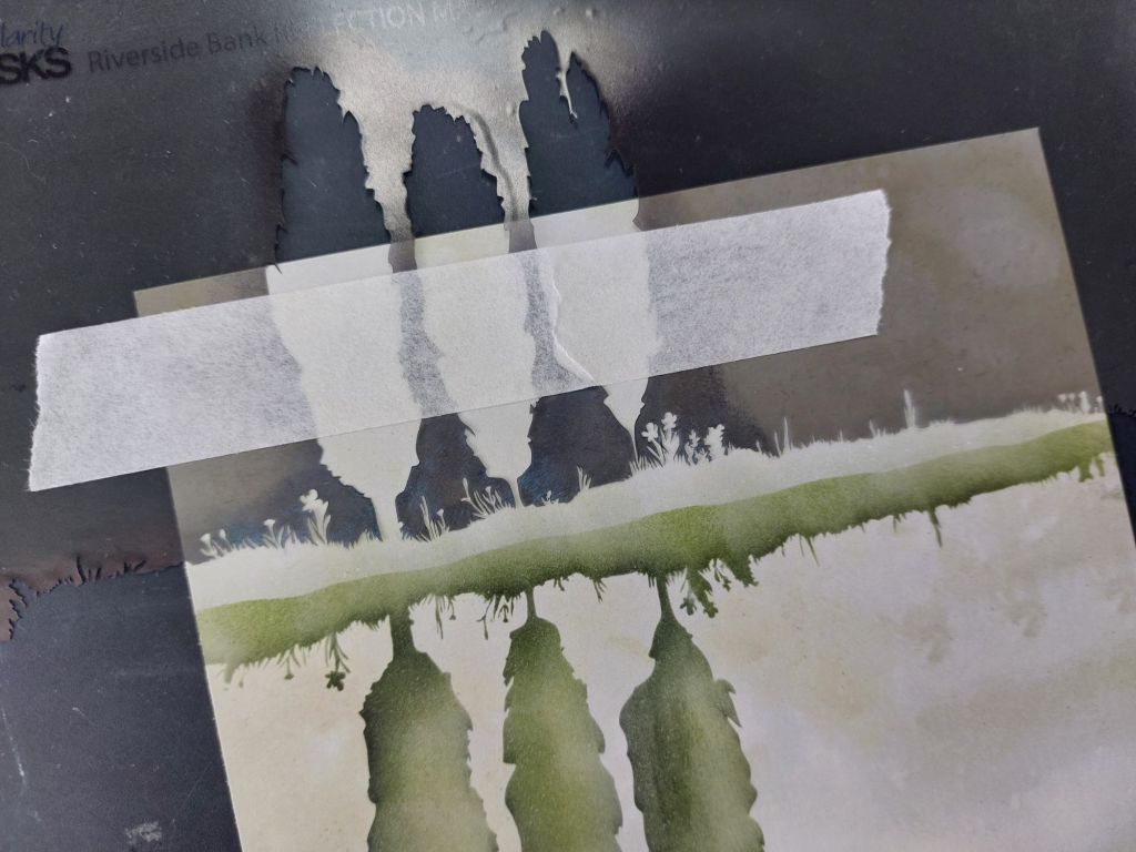
I first cut the Elements Earth card to a square and then laid the Riverside Bank mask onto it. I found the easiest way to do this was to lay the mask on a piece of copy paper, then apply a strip of low tack tape across the lower part of the trees to anchor the two middle strips, then place it on the Earth card and remove the tape. I also laid the ground piece of the mask set to give me the bottom line of my riverbank (forgot to take a pic at that point!) I could then add colour into the open areas of the mask using the new ink blending brushes – I went with ‘peeled paint‘ Archival for the first coat and added shading using ‘balmy night‘. I have to say, the detail on these laser cut masks is just fantastic – look at those flowers and blades of grass along the edge!
I then spun my card round and lined up the Riverside Bank Reflection mask with my first set of trees – you can see on this one how I used the low tack tape to stabilise it. Obviously a reflection in water is a much paler image, so I went with ‘shadow grey’ Archival this time (although I used ‘salvaged patina’ in this afternoon’s show. Either way, you just need a paler tonal colour.
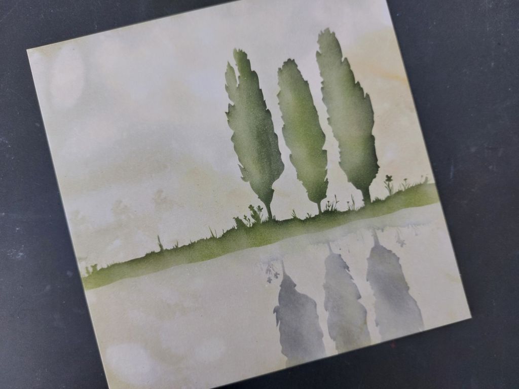
I lightly brushed the ‘salvaged patina’ Archival ink to the water area to add more of a blue tone – you can see from this first picture that it looks a bit grainy. I worked out that this was because there’s a very fine residue left from the masks (it doesn’t feel sticky to touch), which catches the ink as you brush it. I solved it when demoing this afternoon by lightly rubbing the card with a tumble dryer sheet, which solved the problem and meant I could get a smooth finish. I could then move on to the additional elements for my scene, starting with the duck (there’s a whole page of extra images in the set). I laid the little duck mask onto the water area and popped a bit of low tack tape across him where the water line would be – this covered up his feet, which would have otherwise looked a bit odd! I then used a Spot-on Sponge to pounce ‘vintage photo’ through it for my swimming duck.
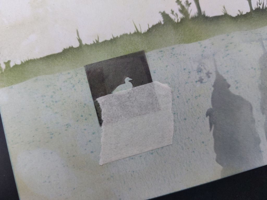
I repeated that couple more times, then used the whole mask for a pair of ducks on the riverbank. I popped a moon mask into the sky and lightly brushed the ‘salvaged patina’ across it – that creates the effect of the moon by darkening the card around it.
All I then needed to do was add one of the A5 Tall Feel Good sentiments suing the ‘peeled paint’ Archival, mount my card onto a piece of Northern Lights companion paper and attach it to the 8×8 card blank.
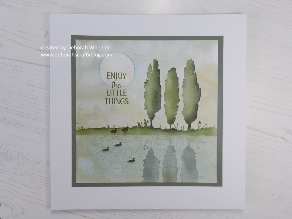
This riverbank looks so inviting after the record breaking heat we’ve had over the last few days – it got very hot in the Clarity studio this afternoon! Paul commented to me during the show that he thought this would make a great picture, mounted on one of of Clarity’s canvas boards instead of a card, and I may try that when I’m finishing off my demo pieces from today.
I’m going to share this with a couple of blog challenges too. Make My Monday are looking for a stencil to be used (I’ve used several masks in building this scene!), while Cupcake Inspirations have gone with ‘anything goes’.


Discover more from Deborah's Crafty Blog
Subscribe to get the latest posts sent to your email.

Just beautiful. So serene and peaceful!
LikeLiked by 1 person
Thanks – I was really pleased with it x
LikeLiked by 1 person
Serene and peaceful which is just what the doctor ordered.
LikeLiked by 1 person
Thanks Johanna x
LikeLiked by 1 person
This is just so lovely – and great technoques xx
LikeLiked by 1 person
Thanks. It’s so satisfying to do x
LikeLike
This is awesome. I LOVE the scene you created with these stencils. So beautiful. Thank you for playing with us this round at Cupcake Inspirations Challenge.
Nora
DT Member
Cupcake Inspirations Challenge
LikeLiked by 1 person
This is such a wow card. It’s stunning. Thanks for joining us at Make My Monday. Love Dawn x
LikeLiked by 1 person
Thanks so much Dawn x
LikeLike
So serene and beautiful! Thanks for playing along at Cupcake Inspirations this month.
LikeLiked by 1 person
Wow wow wow – you created a fabulous scene
LikeLiked by 1 person
thanks so much! These are such fun to play with!
LikeLiked by 1 person