

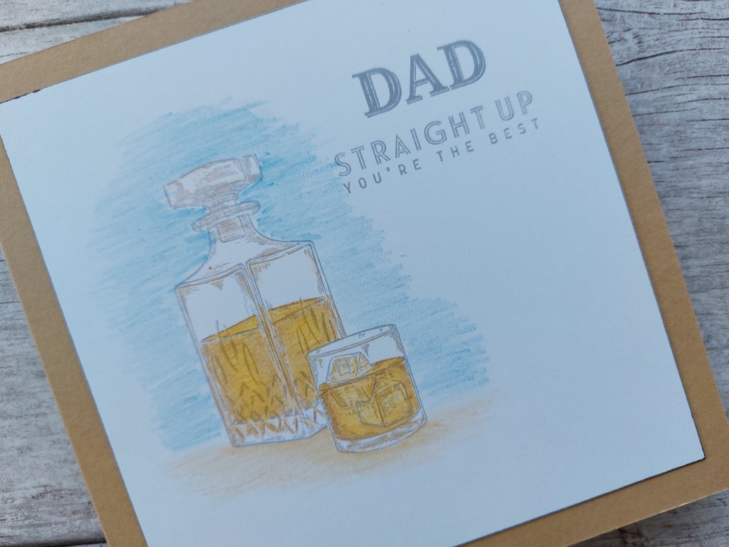
Welcome to my crafty blog and another Father’s Day card. Stampin’ Up!’s ‘whiskey business’ set is so useful for masculine cards. I’ve picked up four challenges for this creation: the colours are from TGIF, the drink theme from The Paper Players and As You See It (both of whom have ‘beverage’ in their challenge), and finally Less is More‘s ‘masculine’.


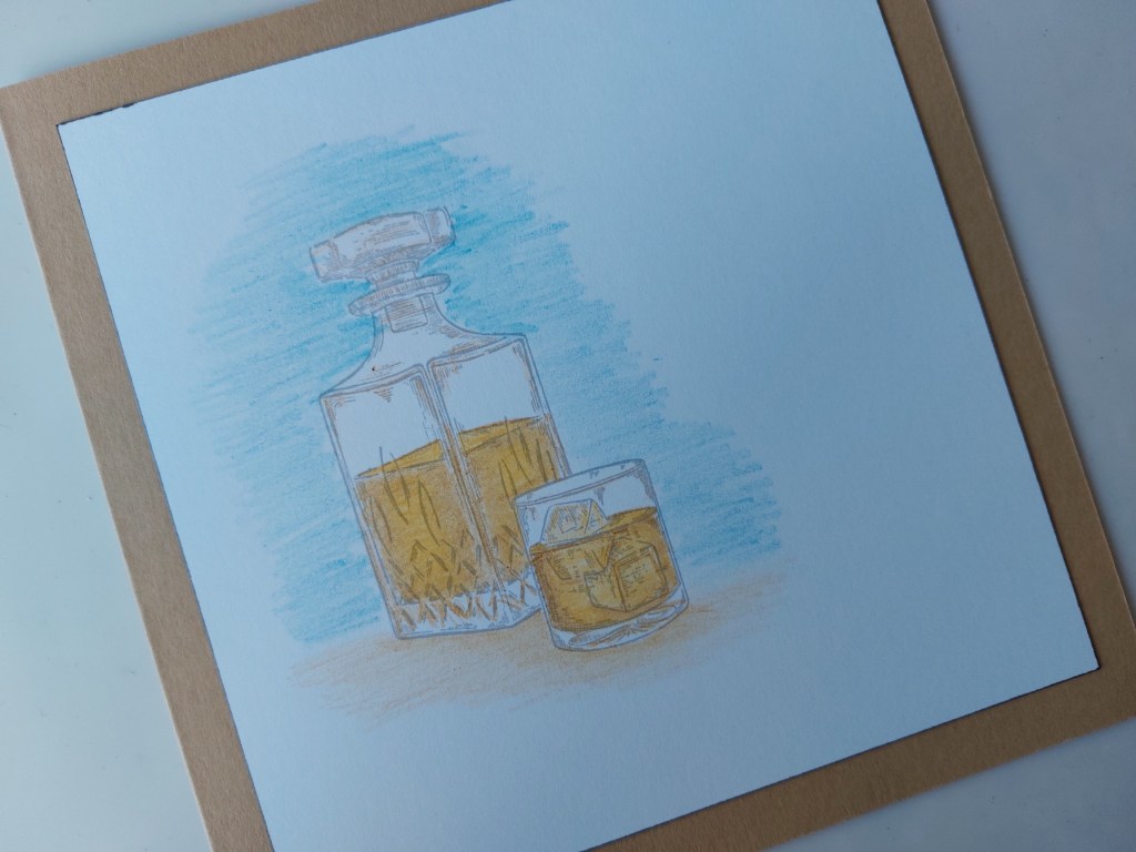
I started by stamping the glass and decanter in ‘shadow grey’ Archival ink – the glass first, which I then masked so the decanter sits behind it. I don’t have the SU colours in TGIF’s challenge, so matched the colours against my Pergaliner pencils. I then shaded the decanter and glass using yellow and light brown pencils – a Pergamano blending nib is very useful for smoothing out the two colours.
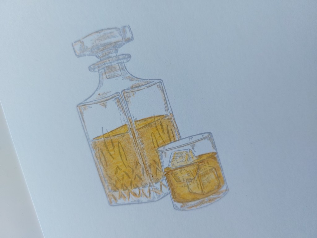
I grounded the glass and decanter by shading more of the light brown below them, and then added the blue around the upper part. I left the colouring a bit scruffy to give the effect of texture. I ran a black Sharpie around the edge of the card and attached it to a 6×6 kraft card blank.
The final touch was to add a couple of sentiment, again in the ‘shadow grey’, with ‘Dad’ from the retired ‘truly tailored’ set and ‘straight up’ from ‘whiskey business’.
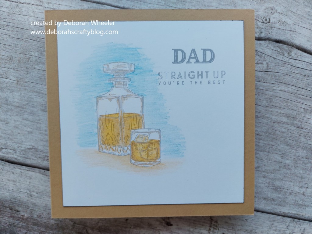
Not quite a one layer card, but there are no embellishements on it (not even my favourite Glossies!)
Discover more from Deborah's Crafty Blog
Subscribe to get the latest posts sent to your email.

Love this!
LikeLiked by 1 person
Good choice of set, Deborah. That strong image suits a CAS card. Good idea to ground the image too. Thanks for joining in with us again at As You See It Challenge.
LikeLiked by 1 person
Wow, Deborah, your coloring on this is fabulous! I find the crystal challenging, but yours is perfect! Great shading for background and surface, too! Thanks so much for playing at As You See It!
LikeLiked by 1 person
Very effective, Deborah! I’m learning to really appreciate the colouring done with coloured pencils. I love your tip about running a black sharpie along the edge of your cardstock to give it definition. Thanks for getting into our theme at As You See It Challenges!
LikeLiked by 1 person
Great guy card, Deborah! I think the colored pencil looks great on your image and you did a great job with the masking technique. Thanks for playing along with the Paper Players this week!
LikeLiked by 1 person
This is fabulous Deborah. The perfect image for a man card and beautifully coloured. Thank you for sharing with us at Less is More x
LikeLiked by 1 person
This IS a great set to use for masculine cards, and you’ve nailed all those challenges perfectly! Thanks for sharing this with us at As You See It this week!
LikeLiked by 1 person
Love the soft watercolor on this scene Deborah. I especially enjoyed your tip about running the black Sharpie around the edges of the white cardstock. It adds just the perfect amount of detail without an extra layer. Thanks for sharing such an awesome idea!
Thank you so much for joining us the week over at The Paper Players!
LikeLiked by 1 person
FAB card, loving your chosen image and colouring too
Kathyk
LikeLiked by 1 person
Great card! I’ve been thinking about purchasing this stamp set. I love it!
LikeLiked by 1 person