

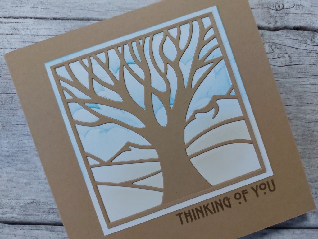
Hello there. It’s a little while since I used one of the aperture dies from Claritystamp, and I thought that one of the panoramic scenes (this is the ‘one tree’) was ideal for the current theme of ‘bark’ over at Inkspirational. I’ve had a second go with the colour palette from Color Hues as well.


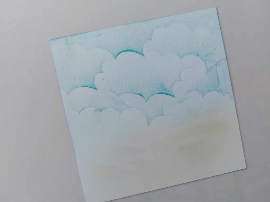
I started by blending ‘broken china’ Distress Oxide over the Clarity clouds mask onto a square of white card. I added ‘pumice stone’ at the bottom where the land is on the die – I sat the die on the card and brushed a little ink through it first to give me a guide, then addded some more without the die. It looks a bit scruffy, but it is just going to sit in the background.
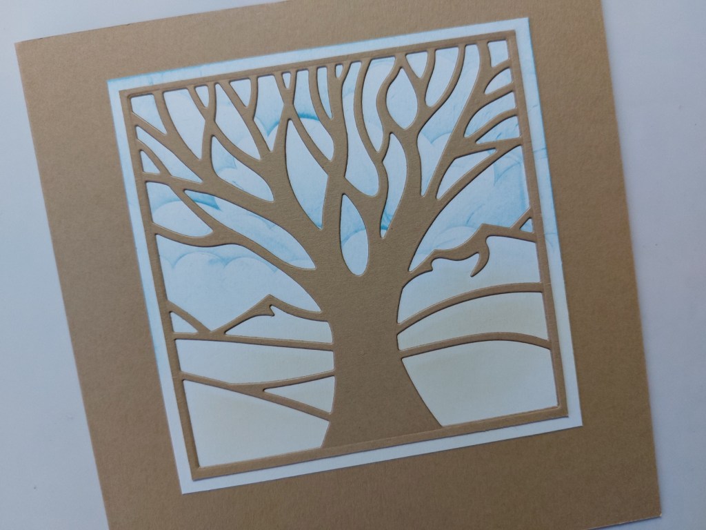
I trimmed a piece of kraft card, added ‘Stick it’ adhesive sheet on the back and then cut the die into it. I could then attach it to the background and stick the whole topper onto a 6×6 kraft card blank.
I finished by stamping one of Clarity’s ‘art nouveau’ sentiments below the die cut, using ‘pebble beach’ Archival ink.
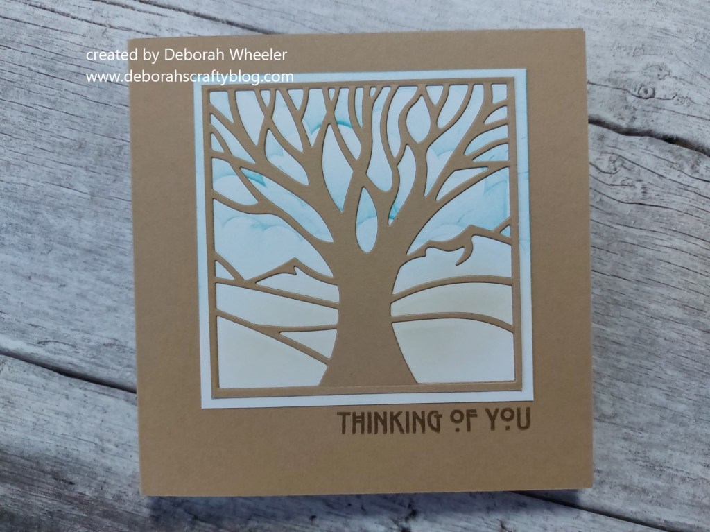
I’m pleased with the way the colours show through against the die cut – I was worried at first that I’d been a bit heavy handed with the blue ink but I think it works.
Discover more from Deborah's Crafty Blog
Subscribe to get the latest posts sent to your email.

Great card!
LikeLiked by 1 person
Thank you!
LikeLiked by 1 person
Love your tree and subtle background, Deborah! Happy to see you again at Color Hues!
LikeLiked by 1 person
The stencilled and blended background is perfect for this majestic tree! Thanks for joining us at Color Hues!
LikeLiked by 1 person
You’ve certainly created a lovely showcase of this tree! Beautiful! Delighted to see you in the INK and Color Hues galleries!
~carol
LikeLiked by 1 person
What a fantastic die! Great choice to use kraft and the inked background is a beautiful detail. Thanks for joining our challenge at Inkspirational.
LikeLiked by 1 person