

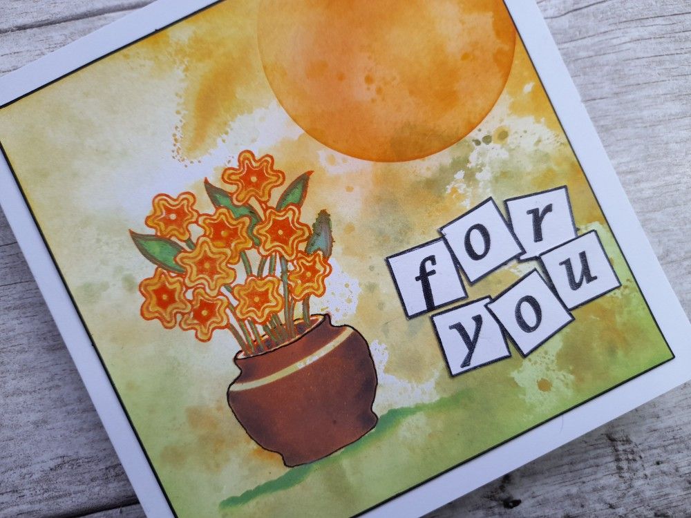
It’s Sunday evening again and I’m back with another dip into Claritystamp’s new design club – this time it’s the ‘pot plant’ from June 2015. I’m not sure I’ve ever actually used this one, but thought it would work well with one of Clarity’s stencil vases and the ‘letterbox alphabet’ stamps that I’ve had for years.
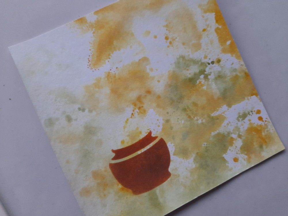
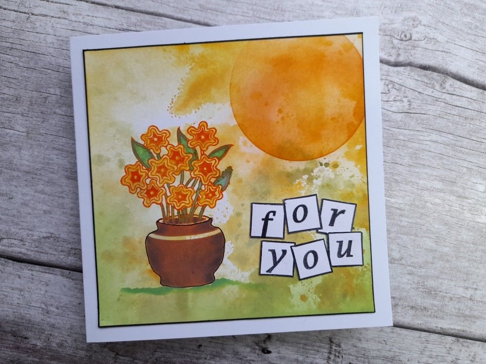
I started with a green and yellow inky background from my stash of mop-up pieces, and trimmed it down to fit on a 6×6 card blank. I laid the ‘vases’ stencil over it and masked it off apart form the one I wanted. I then sponged a blend of ‘ripe persimmon’ and ‘walnut stain’ Distress Oxides into it to give the right shade for terracotta.
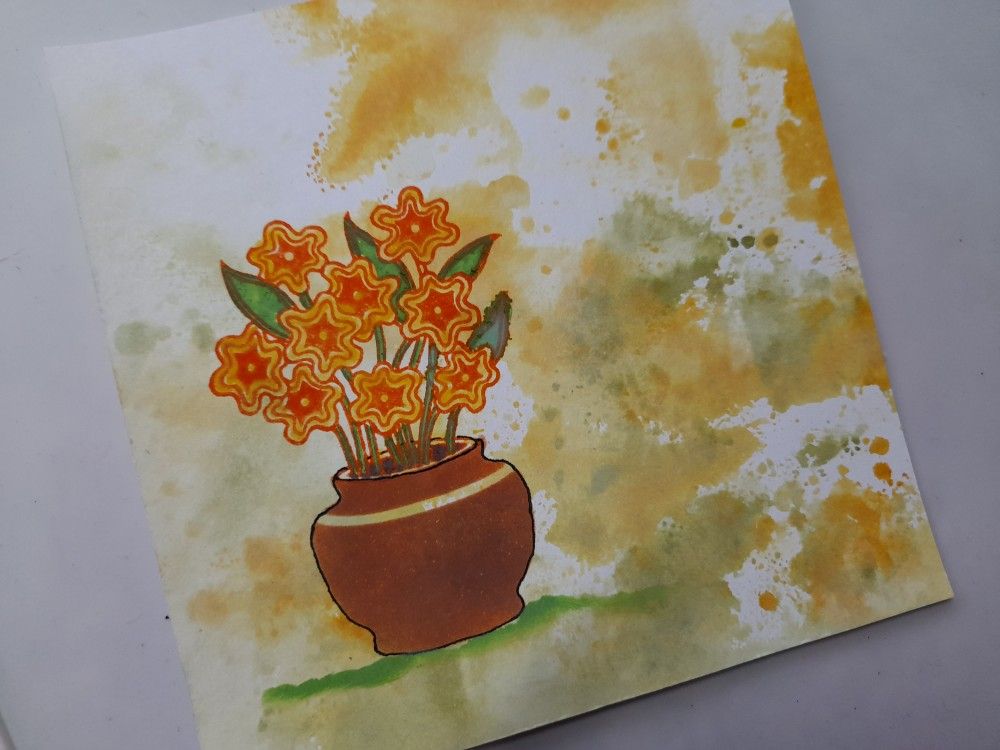
I then positioned the ‘pot plant’ stamp to sit neatly on top of the pot (I used my stamping platform) and then stamped it using the ‘ripe persimmon’ as I wanted orange flowers. I used a Pergamano blending nib to then add ‘mowed lawn’ to the stems and leaves, ‘walnut stain’ to the soil and ‘mustard seed’ to the centres and outer parts of the flowers. I gave the edges of the pot a bit more definition with a micron pen and sponged the ‘mowed lawn’ along the edge of a torn piece of copy paper so the pot was sitting on the ground.
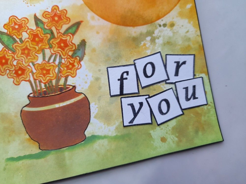
For the sentiment, I stamped the letterbox outlines and then added the words using the alphabet stamps. I fussy cut the boxes out and glued them into the space next to the pot.
I thought the pot looked a little flat still, so I repositioned the stencil and sponged a little black ink onto each side to give it shading. The topper then went onto a 6×6 card blank.
Thanks for dropping in. We’ve had very heavy rain and thunderstorms here all afternoon – apparently there is a lot of local flooding but it will hopefully have drained away before I head out to work in the morning. At least I don’t need to water the pots in my garden this evening!
I’m going to share this card with a couple of current blog challenges. As You See It have given us a colour scheme this week (and I picked up the flowers in their photo as well!) I’ve also used the right had column from TicTacToe‘s grid – orange, free, alphabet stamps.


Discover more from Deborah's Crafty Blog
Subscribe to get the latest posts sent to your email.

I love how you make such beautiful cards out of leftover backgrounds! The shading and grounding detail of your pot make a huge difference to the finished effect – it’s all in the little details. A great take on this week’s colours! Thanks for sharing with us over at As You See It and TicTacToe this week!
LikeLiked by 1 person
Thanks so much Joanne 😁
LikeLike
Smooshing backgrounds come in so handy and yours is perfect behind the pretty pot of flowers. Thanks for joining us at the Tic Tac Toe Challenge this week!
LikeLiked by 1 person
Gorgeous! I need to sit down one day and make a bunch of backgrounds. Another crafty friend of mine has a huge stash of distress ink and alcohol ink backgrounds, and I’m always amazed at how quickly her projects come together using those. One of these days I might find the time, lol!
LikeLiked by 1 person
I think every crafter’s got a list of things to do when we’ve got the time….!! 🤣
LikeLiked by 1 person
Beautiful background, Deborah! The sponged sun works right into it! I love the sentiment “boxes”! They fit so well! Thanks for playing along with our colour challenge at As You See It Challenges!
LikeLiked by 1 person
Wow! What a fabulous background your leftover has made – just like it was made for the job! Wonderful stencilling, especially with the addition of some shading. Thanks for playing along with us at As You See It.
LikeLiked by 1 person
Gorgeous. Gives out a lovely warmth when you look at it!
LikeLiked by 1 person
This is such a great card….fabulous background and your pot of flowers is so sweet! Thanks for sharing this with us at As You See It this week!
LikeLiked by 1 person