

Welcome to my crafty blog. I decided to have another play with Stampin’ Up!’s ‘a touch of ink’ set – I just love this little hummingbird. I picked up the colours from CAS Colours & Sketches, which are right in the middle of my favourite palette. The style was inspired by this week’s themes of ‘clean & simple birthdays’ at The Paper Players, and ‘B is for Birds’ at the Alphabet Challenge


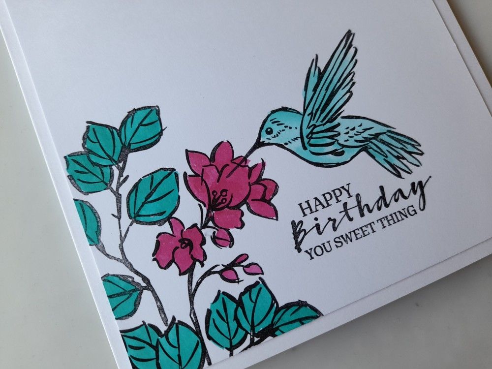
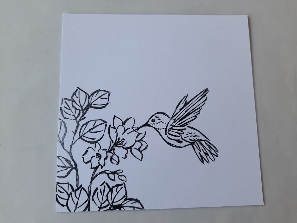
I started by stamping the flowers, leaves and hummingbird in black Archival onto a piece of card that I’d trimmed down to fit on a 6×6 card blank.
I then coloured the images using Artistry ink and a waterbrush. I went for ‘tenacious teal’ on the leaves, ‘aqua fusion’ on the hummingbird (with a little of the teal added to his wings, tail and head for shading) and ‘fancy fuschia’ for the flowers.

All I then needed to do was add the sentiment from the ‘sweet strawberry’ stamp set – I think it works so well with the hummingbird sipping the sweet nectar. The topper then went on the card blank to finish.
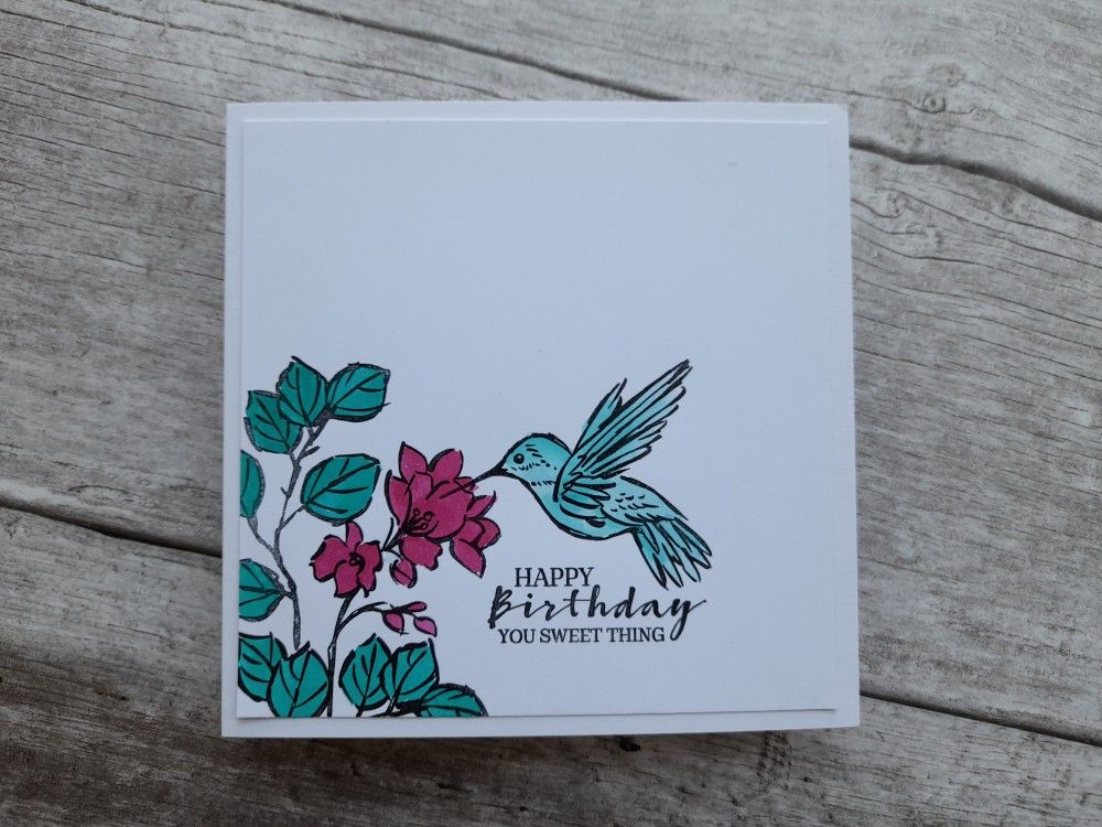
I do like clean and simple (CAS) style cards. I have to confess that this is my second attempt at this one – the first was not quite so clean after I’d dropped my black inkpad smack in the middle of it! Why do they always land inky side down (just like a piece of buttered toast)?!
Discover more from Deborah's Crafty Blog
Subscribe to get the latest posts sent to your email.

Deborah, this is such a beautiful birthday card. I love your hummingbird and all the gorgeous flowers! So happy you joined us at The Paper Players this week!
LikeLiked by 1 person
What a beautiful CAS birthday card Deborah that fits the bill perfectly for your trio of challenges. Great sentiment too – perfect with the hummingbird. Thanks for sharing with us over at The Paper Players and CAS Colours & Sketches this week!
LikeLiked by 1 person
Love this! And you’re not the only one who has dropped an ink pad in the middle of the work! I always wonder the same thing, lol!
LikeLiked by 1 person
I know – it’s so frustrating!!
LikeLike
So beautiful, Deborah! Love the pop of bright color on the clean design. SO pretty! Thanks for sharing with us over at The Paper Players.
LikeLiked by 1 person
So beautiful! A wonderful use of the colours:)
LikeLiked by 1 person
What a lovely card – great colours – I think it looks better not having a black ink pad mark on it! 🙂 Thank you for joining us at The Alphabet Challenge xx Lynda/Loopyloo DT
LikeLiked by 1 person
Beautiful coloring. Thanks for playing along with us at CAS Colours and Sketches Challenge. Looking forward to seeing your creative projects in the future galleries.
LikeLiked by 1 person
This is such a great CAS card design! I love the images and your layout placement! Thanks so much for sharing it with us at the Alphabet Challenge “B” is for Bird! Good luck with your DT entry!
Rachelle DT : )
LikeLiked by 1 person
I love this stamp set! I love how you used the colors, beautiful coloring. Thanks for joining us this week at CC&S
LikeLiked by 1 person
Haha, I have had the same thing happen to me with a dropped ink pad Deborah! And you’re right… always ink side down!!
I love the design of your card, square and with an off-the-edge image, and it works beautifully with our colours. Thank you for joining in with this week’s CAS Colours and Sketches challenge 🙂 Vicky x
LikeLiked by 1 person