

Hello! Welcome to my little crafty blog. I was sitting by my back door yesterday, and realised how much bird song I could hear in the sunshine, now there is virtually no traffic noise. It’s a very unusual sound living here on the edge of London, and I’ve realised how much I took it for granted when I grew up in a small rural town
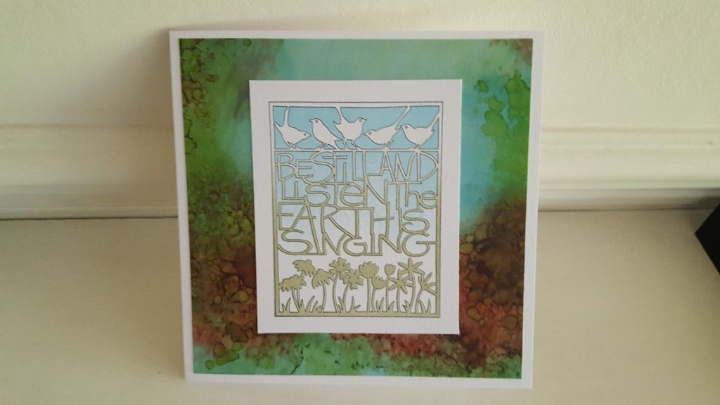
I needed to make a birthday card for a friend, and so this lovely three stamp set by Claritystamp came to mind (and it’s on special offer on their website at the moment!). This is one that Barbara Gray demonstrated on the Clarity retreat last year, and I’ve based this card on the one I made then that went wrong! it’s funny sometimes how what we see as mistakes turn out to give us new insights into ways of doing things, don’t you think? This design came about because I picked up the wrong stamp for the third part of the card, but actually I decided I really liked the effect.
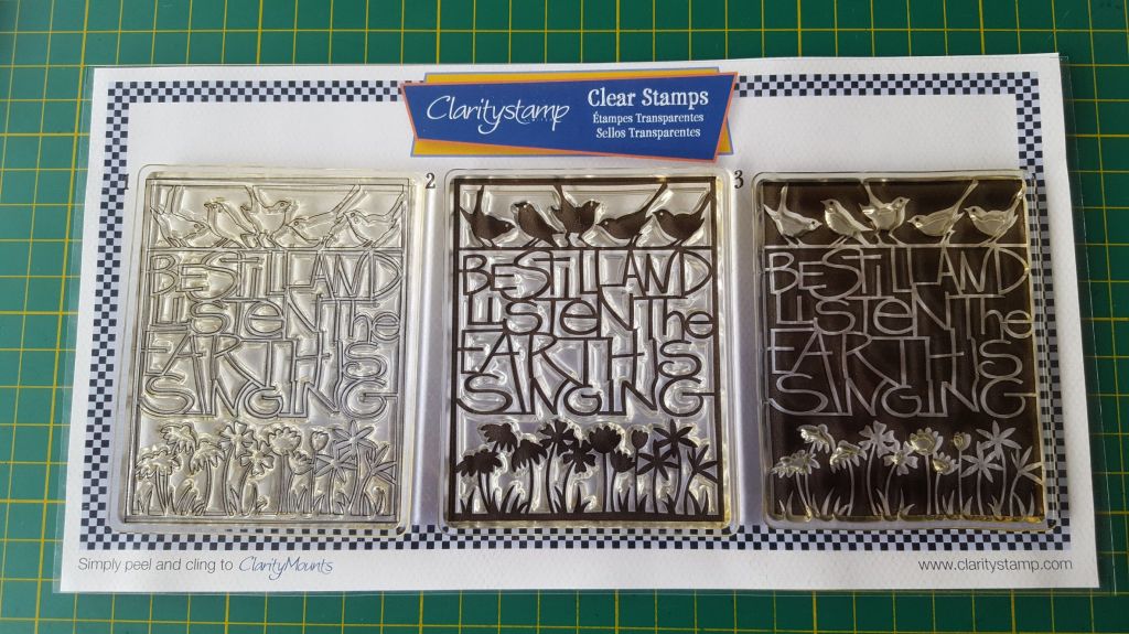
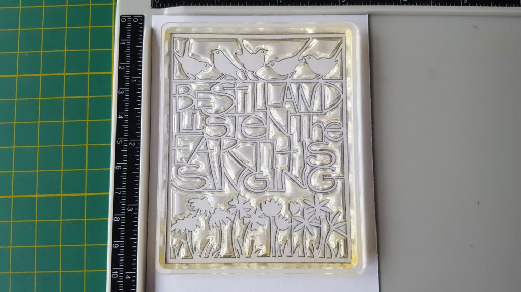
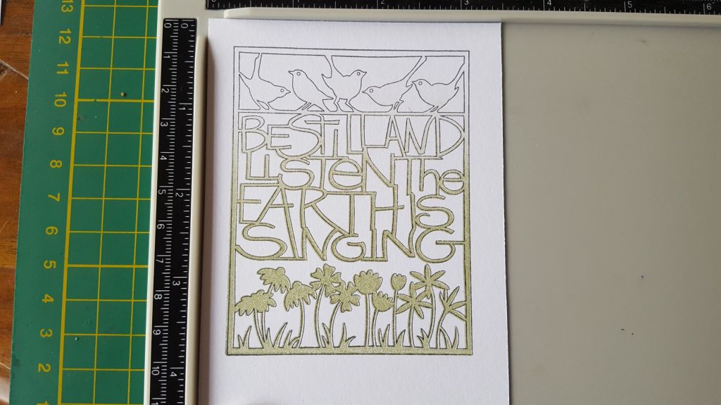
I cut a piece of the Clarity stencil, card in half, and stamped image 1 onto it, using Archival ink in Watering Can. This will give you the outline. Then take stamp 2 (which fills in the design) ready to add some colour. I use a stamping platform for this, as I find it easiest to line up the stamp first before I add the ink
The trick to these stamps is to add the ink with a brayer, not directly from the inkpad. I inked up my brayer with Distress Ink in Peeled Paint, and then rolled it onto the stamp, but only covering the bottom two thirds to three quarters of the stamp (I was aiming to cover to the top of the words)
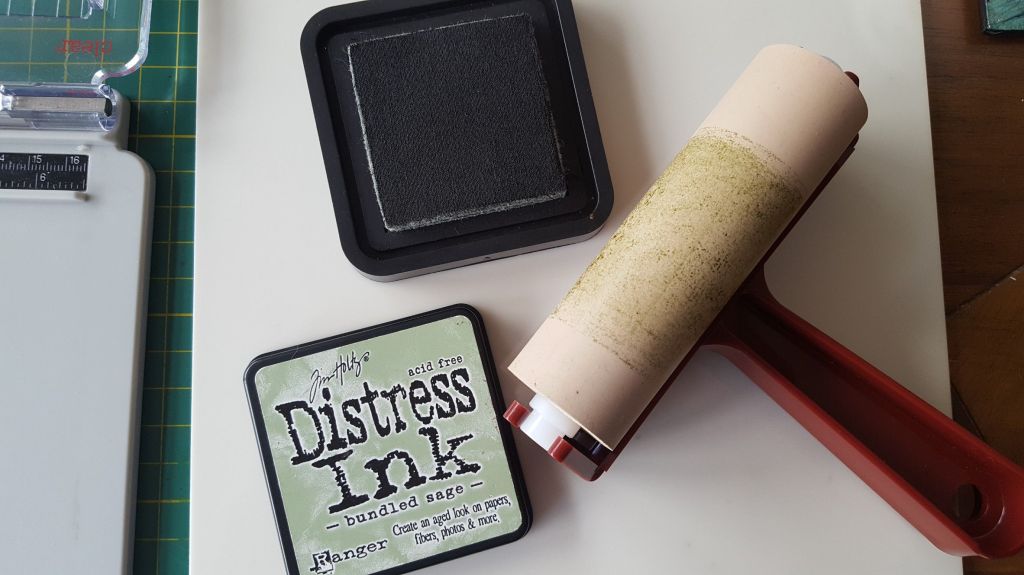
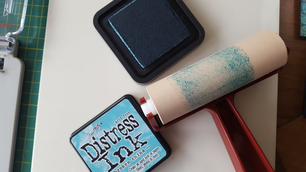
Now this is where I went wrong the first time I did this on the retreat, as I’d intended to have blue birds. However…. if you now take stamp 3, this will fill in the background around the design. Again, ink up the brayer, this time with Distress Ink in Broken China, and add it to the top third to half of the stamp. Don’t worry too much if you’re not sure how much you need – put down a light coat and you can always then stamp it a second or third time to deepen the colour.
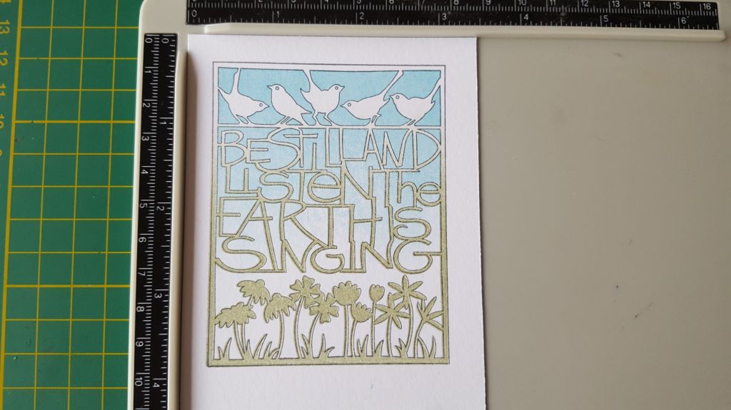
I loved the graded effect this gave with the colours, so decided it was not so much a mistake as a new approach! all that’s then left to do it to trim down the stencil card along the bottom edge, and then mount it on some of the Clarity designer paper. I used a piece from the Shenandoah pack, as I wanted the effect of ground and sky behind the image, and then mounted it on a 6×6 card blank

That’s all there is to it! I’m planning to sit in the garden this afternoon for a bit and listen to the birdsong. Stay safe everyone, wherever you are.
Discover more from Deborah's Crafty Blog
Subscribe to get the latest posts sent to your email.

We had a virtual crafting session together I saw it hot off the press. It’s a lovely card.
LikeLike
Thanks Jean!
LikeLike
Very cool Deb – I like xxx
LikeLike
Thanks !
LikeLike
Deborah, I love this card and the message. Just lovely.
LikeLike
Thanks Barbara
LikeLike