

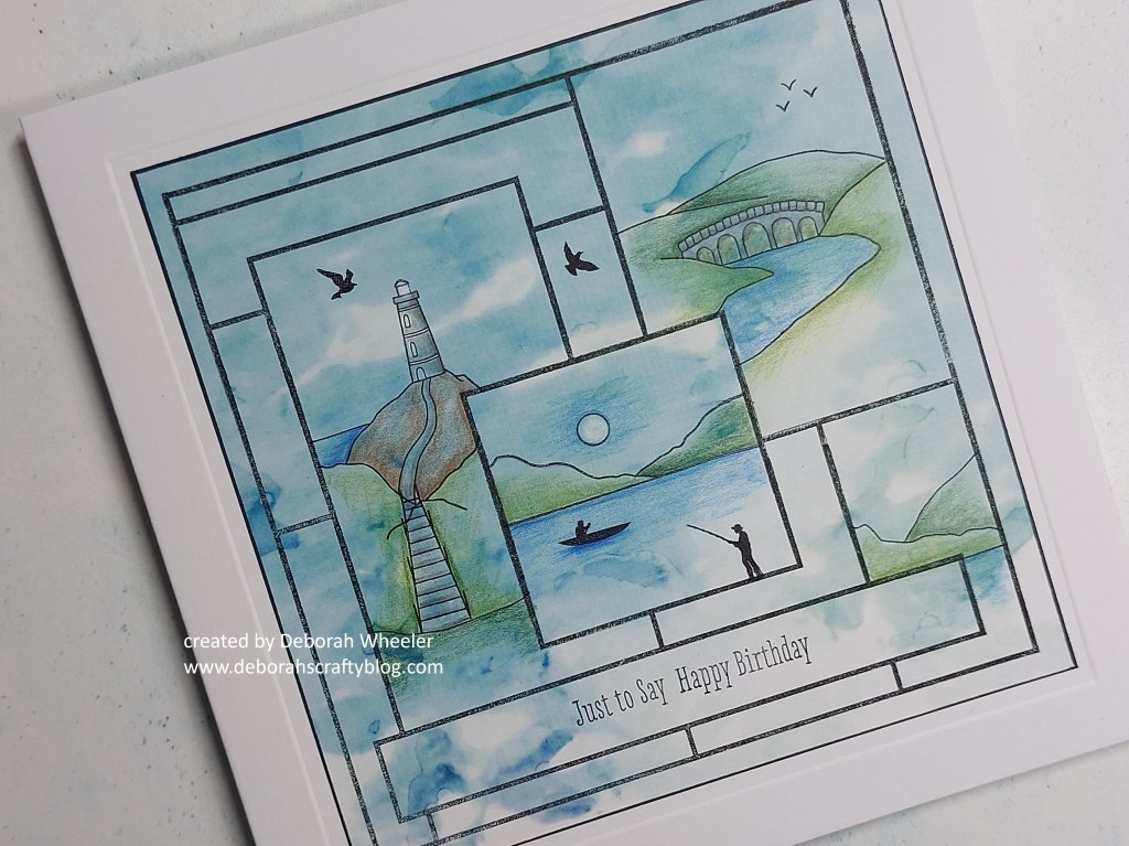
Hello crafty friends and welcome to Monday! I’m dropping in with one of the new Mini Landscape stamp sets from Clarity that Barbara & Paul launched this afternoon (catch the show here) – this card uses the Waterside set. Now the clue’s in the title of these stamps – they’re designed for small toppers on cards, which can be less intimidating than trying to make large cards, but I’ve used one of the Clean & Tidy layout stamps to build a little montage of scenes on a slightly larger 6×6 card.
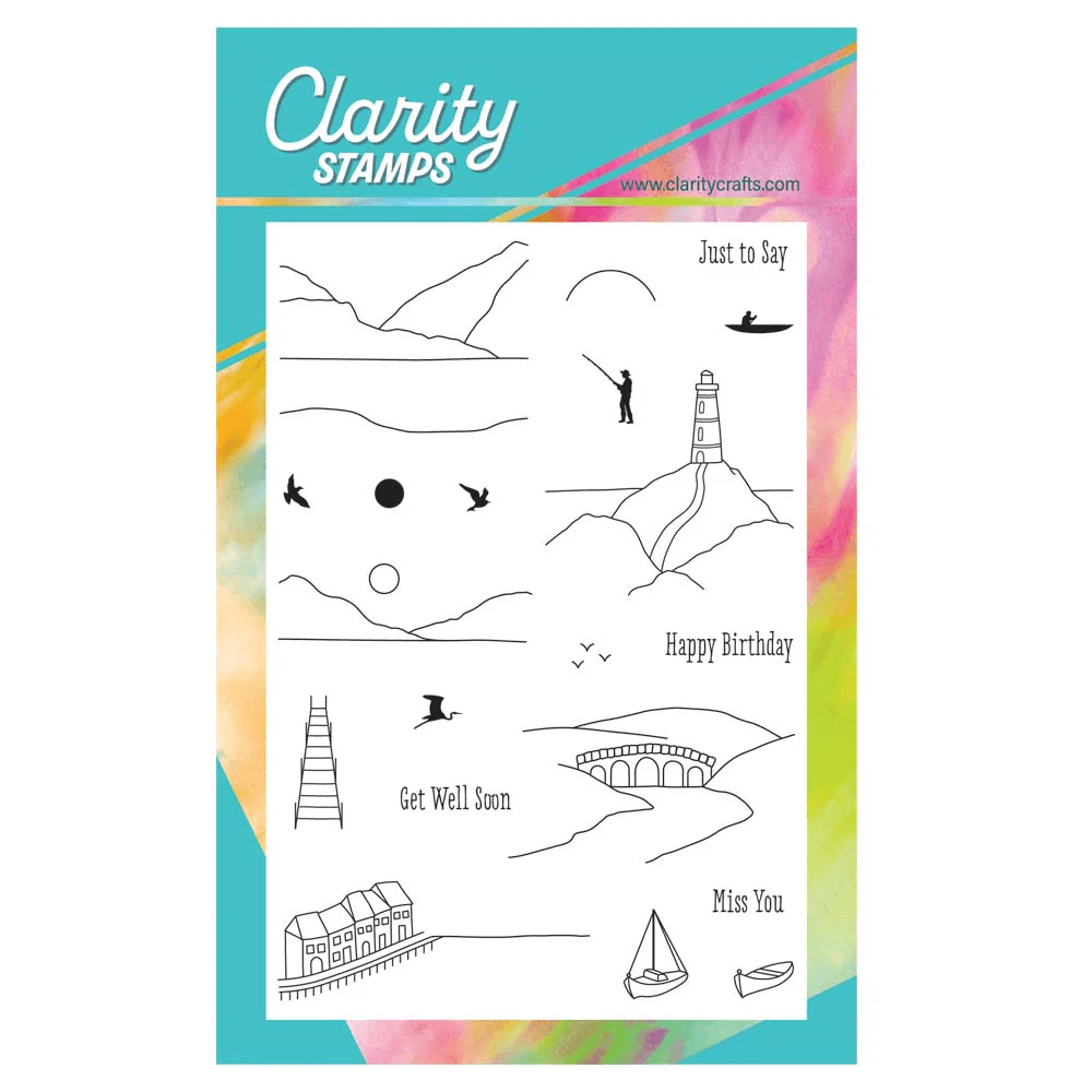
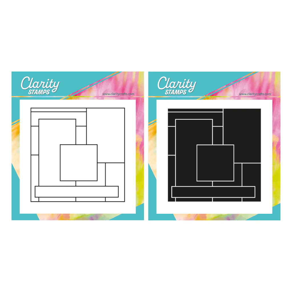
As luck would have it, I found a piece of Antarctica designer paper in my folder that was exactly the right size for the layout stamp – happy days! I stamped the layout with black Archival ink and covered the key sections up with the pre-cut masks that come with the stamps. It was then easy to add three of the little scenic stamps into the larger boxes, removing those masks one at a time. Where the image didn’t quite reach the edge of the box (for example, with the river coming down from the viaduct), I simply extended the line down with a black Micron pen.
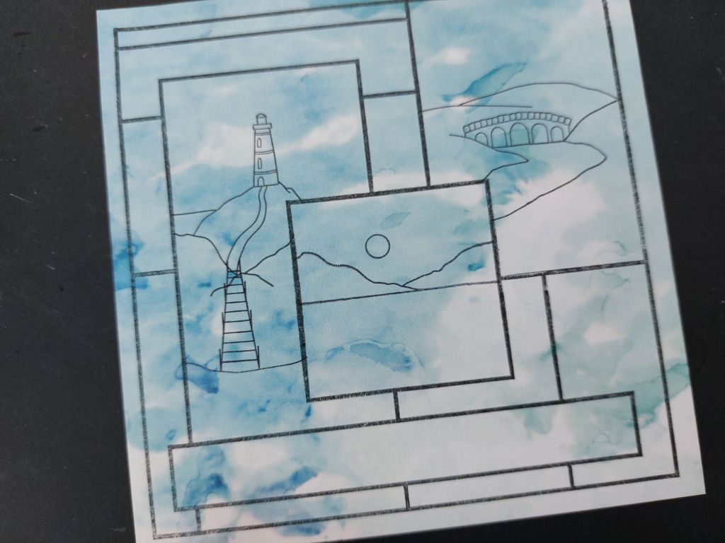
Next was to set to work with my Polychromo pencils to add shading to the scenes. I used a selection of greens, blues, greys & browns, but didn’t colour the whole areas in as I wanted to also make use of the pattern on the designer paper. For the moon, I did a couple of things – first I shaded round it with a blue pencil which increases the contrast so that it looks lighter straightaway, but I then also went over it gently with an ink eraser pencil, which helped lift a little of the colour from the paper and lighten the moon.
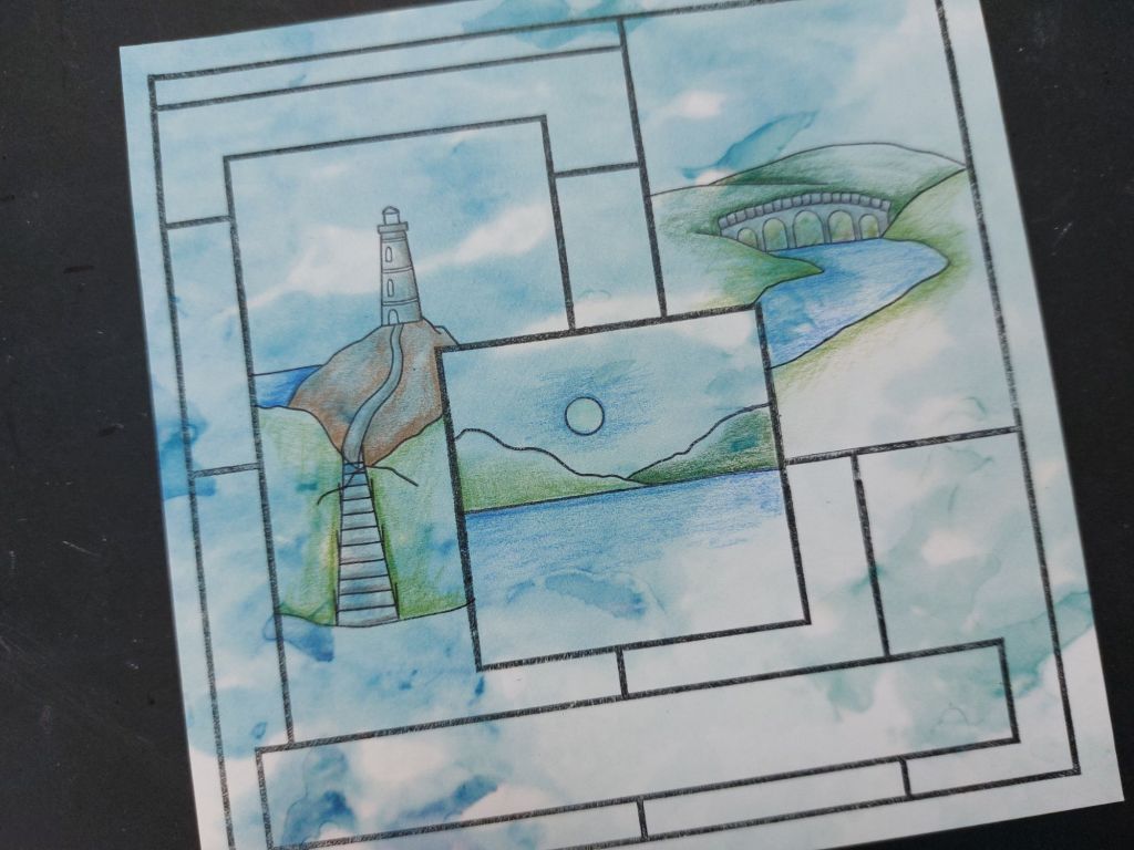
I added another little scene down in the bottom right hand box, as that area looked a bit empty on reflection, then used several of the other stamps from the set to add the birds and the two chaps at the lake. I stamped two of the sentiments into the bottom box and edged the paper with a black Sharpie – I always use a ruler to do that on paper as I’m afraid of the pen being more likely to slip against the thinner edge than it does with cardstock (and the last thing I want is a black streak across the front of my artwork!). Finally, I embossed a frame onto a 6×6 card blank with a square embedder and a ball tool, then attached my topper to sit inside it.
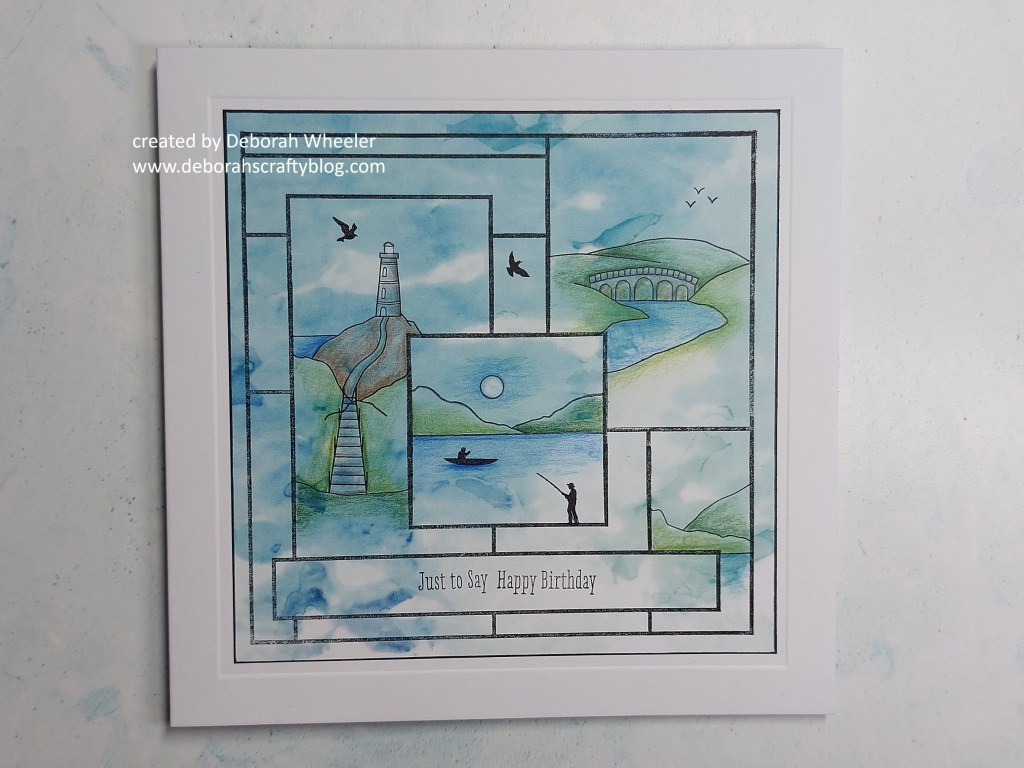
These images are such fun to play with – they really work for masculine cards (like this one) but also for lots of occasions and general notecards. I’m heading off to share this card with a few challenges, starting with the ‘water’ theme at Inspire.Create. The Male Room are looking for vehicles/transport (check out that little rowing boat!) and my beautiful designer paper background hopefully fits the bill at Love Those Pretty Papers!


Discover more from Deborah's Crafty Blog
Subscribe to get the latest posts sent to your email.

Oh, Deborah, what a wonderful masculine card! I had never heard of this type of stamp set before, but your choice of background paper and hand colored detail really created a striking card!! Thank you so much for introducing me to this company’s stamp set, and for sharing your creativity with us at The Male Room “vehicles or transport” challenge. -Donna
LikeLiked by 1 person
What an amazing set of scenes you have created. Its a gorgeous card.
LikeLiked by 1 person
Thanks so much Johanna. They’re great little stamps
LikeLiked by 1 person
So pretty! Loving all the water scenes!
LikeLiked by 1 person
thanks! It came together really well with the layout stamp!
LikeLiked by 1 person
[…] don’t think you can get much more of a contrast from yesterday’s card than this very minimalistic card! It just shows how very versatile these stamps are. And it […]
LikeLike
Beautifully done Deb! Thanks so much for joining in the fun at our Love Those Pretty Papers challenge! Good Luck and we hope you’ll come back often. Darlene . . . Love Those Pretty Papers Co-Owner
LikeLiked by 1 person
This is so cool!
LikeLiked by 1 person
Thanks Verity x
LikeLike
What an amazing card!! Love that stamp!!
LikeLiked by 1 person
SO much detail in this special card Deoroah! Love the use of the Dp for the background and all your beautifully coloured little scenes! 🙂
LikeLiked by 1 person