

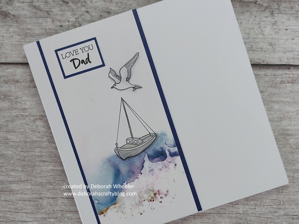
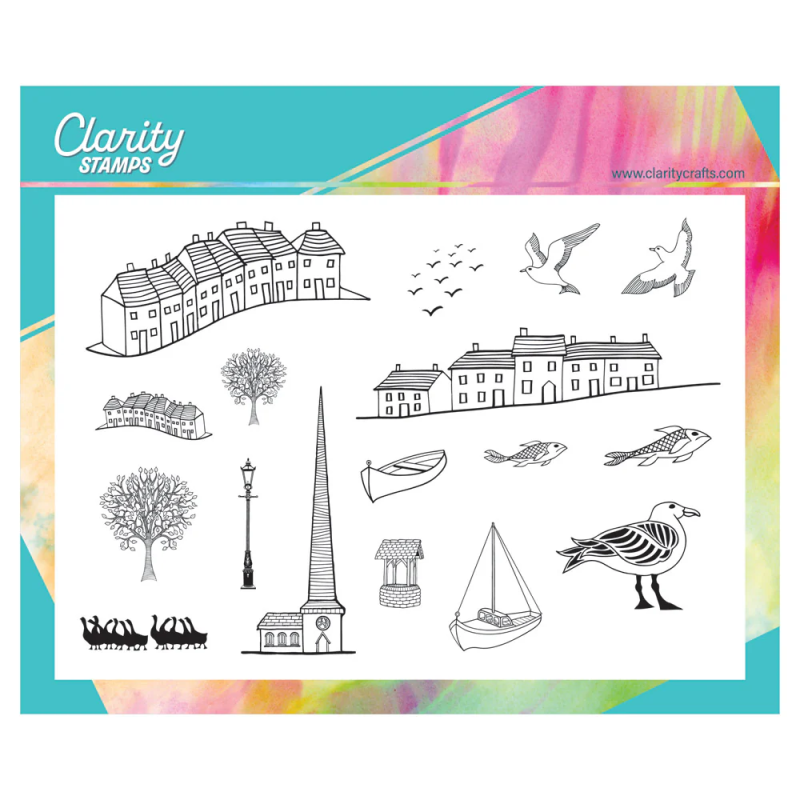
Hello friends. I’ve got a card today that I demo’d on Clarity Social TV a few months ago, but hadn’t blogged in detail (until now!) It uses the Village & Harbour stamp set, together with an offcut of Antarctica designer paper that was sat in my storage folder – a great set of stamps for a more masculine style.
This design works for a couple of challenges as well. Cardz4Guyz are looking for boats on our cards this time round and Allsorts want ‘something beginning with B’ – well I’ve got a bird to offer in addition to my boat!


So, let’s talk through my process, which is pretty simple but has one useful little touch. I started by trimming the paper to fit on a 5×5 card blank (top to bottom) and stamped the boat on bird onto it – I thought the pattern on the paper looked like a shoreline. Now, at this point, the boat appears to be levitating, so I needed to extend the sea around it. I did that by shading with a couple of blue Pergaliner B pencils (the oil based ones) and then smoothed the pigment out with Dorso oil and a blending nib. Once done, it looked like part of the original colour on the paper.
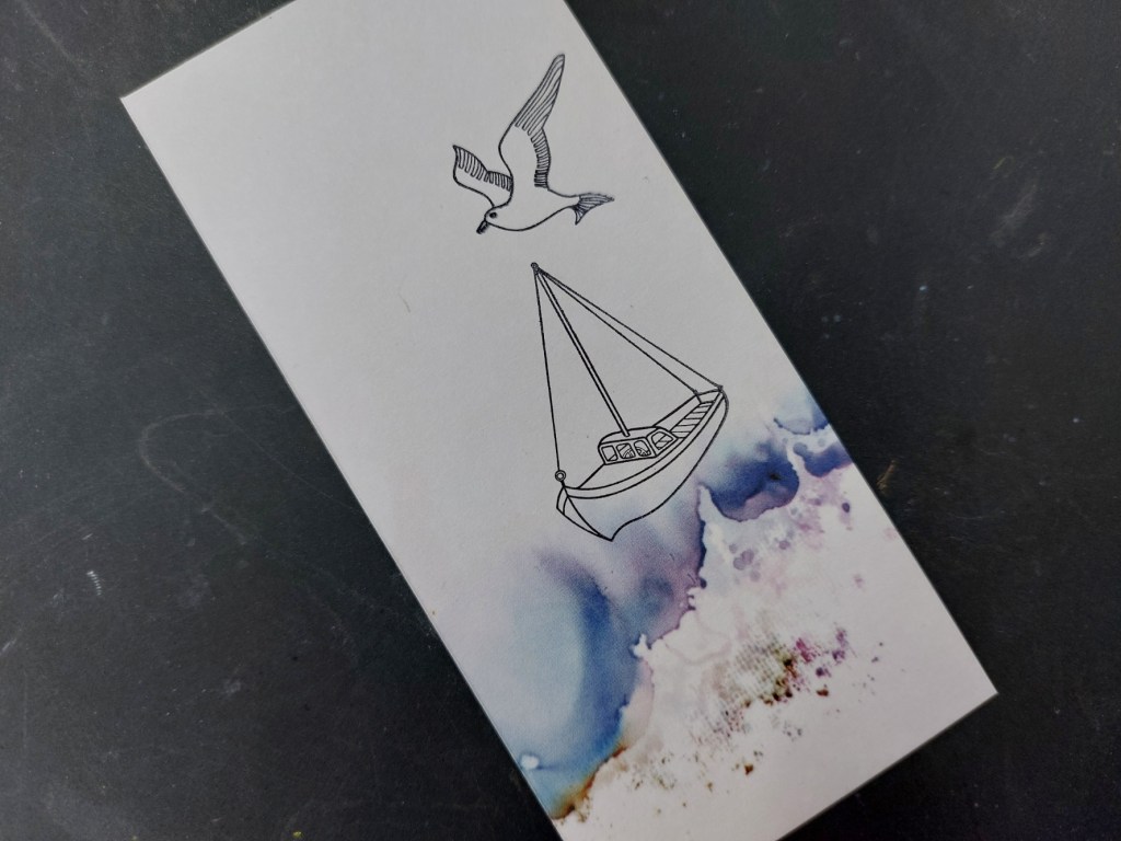

Having added a little grey shading to the boat and the seagull, I edged the paper with strips of dark blue and attached it to the card front. I added one of the Pinky Gray word stickers on a blue mount to finish.
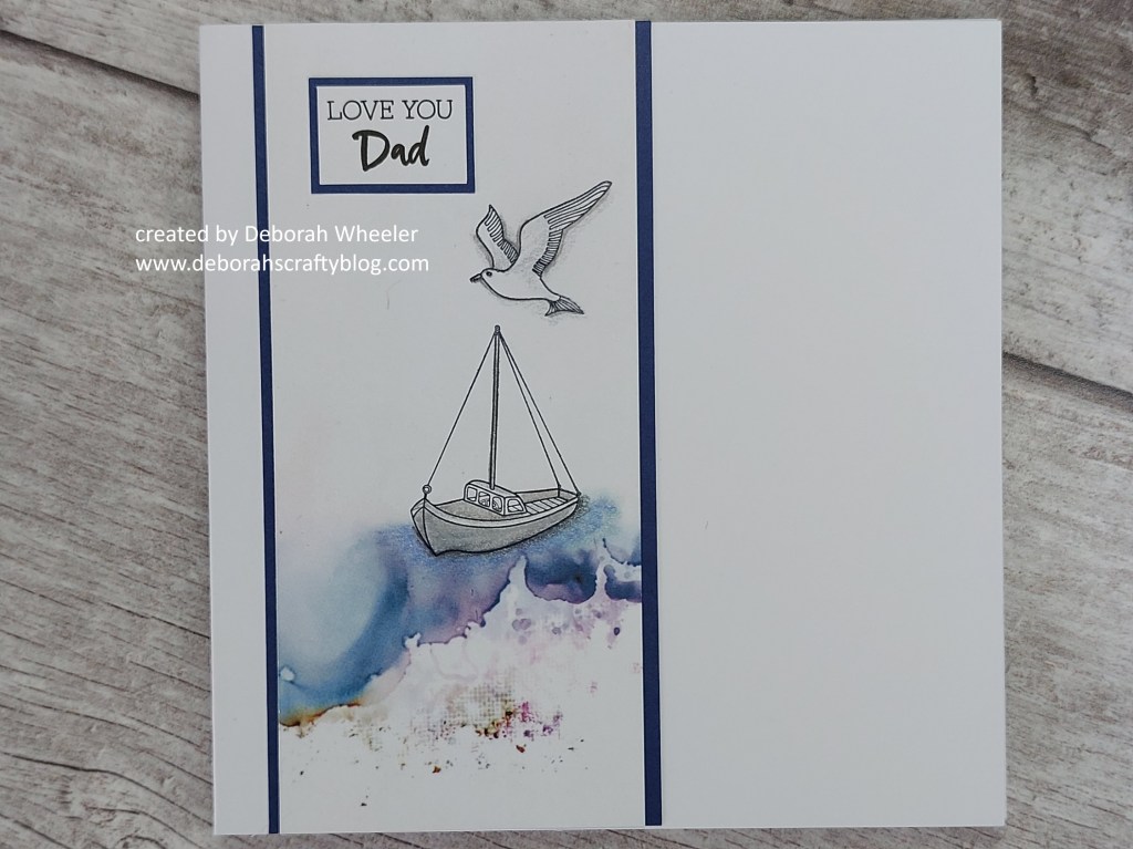
So there you are – nice and simple but a useful little technique for adding extra colour to your designer papers!
Discover more from Deborah's Crafty Blog
Subscribe to get the latest posts sent to your email.

Perfect for a boat lover and your water looks like the real thing
LikeLiked by 1 person
thanks so much x
LikeLiked by 1 person
Fantastic…I love your blending of the shoreline into your paper…so cool!! Your image is perfect for our BOAT challenge over at Cardz 4 Guyz!! Thanks for joining the fun and playing along with us!! Deb Horst, DT #C4G377
LikeLiked by 1 person
Beautiful! xoxo
LikeLiked by 1 person
Thanks – it’s very simple!
LikeLike
Great masculine card!
Thank you for joining us at Allsorts and playing the theme!
LikeLiked by 1 person
Wow, this is fabulous!
LikeLiked by 1 person
thanks – very simple!
LikeLiked by 1 person
Such an effective card design. Thanks for joining my theme over at Cardz4guyz. Love Dawn x
LikeLiked by 1 person
Just beautiful, Deborah!
LikeLiked by 1 person