

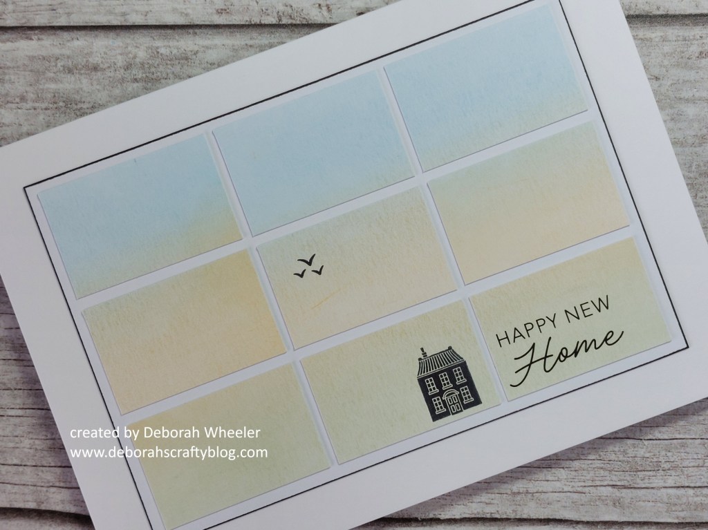
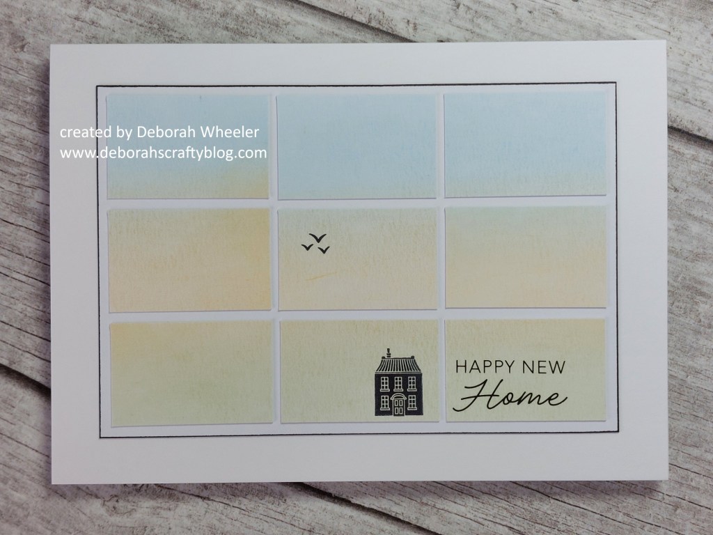
Hello crafty friends. Time for our next theme at CAS Colours & Sketches and Shannon has really challenged us with this sketch of rectangles – but they have to be plain with no pattern!
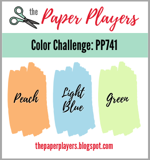
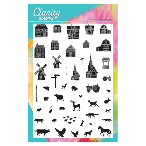
I really had to think hard for this one, but in the end opted for a blended panel using the colours from The Paper Players – there’s no pattern in my rectangles, but I pushed it very slightly by adding a little house from the Build a Landscape – Buildings & Animals set.

My starting point was one of Clarity’s 6×4.5″ pieces of stencil card, which I trimmed down to 5.5″x3.5″ then brushed ‘bundled sage’, ‘dried marigold’ & ‘tumbled glass’ Distress Oxides onto to form a bit of a landscape & sky effect. I’d have loved to use masks for this, but reined myself in to stick to the no pattern theme!

I then chopped it into nine rectangles and mounted them onto another piece of the stencil card – top tip was to use glue for this to have a bit of wiggle room. I did the top row first, using my Pergamano ruler edge to get them straight and evenly spaced. I then came down the left hand side, again using the ruler along the edge, then along the bottom and up teh right, finishing with the centre piece. I popped the little house along the bottom plus a trio of birds from the Just Woodland & Birds set, then added one of the new Rub-On sentiments.

I then simply ran a black Sharpie around the edges of the mount and attached it to a 5×7 card blank.
On reflection, I think this would have been better on a smaller card – even for me it feels very empty! I rather like the blended ink effect across the rectangles. Do check out the inspiration from the rest of the challenge design team over on the CAS Colours & Sketches blog (they’ve got some great ideas) and then we’d love to see your creations in our gallery.
Discover more from Deborah's Crafty Blog
Subscribe to get the latest posts sent to your email.

Beautiful CAS card, Deb. Love how you’ve pushed the theme a wee bit xoxo
LikeLiked by 1 person
thank you!
LikeLike
This is gorgeous- a “show-stopper” ! It looks so simply perfect.
LikeLiked by 1 person
thanks so much!
LikeLike
beautiful, I love the ink blending and the little house
LikeLiked by 1 person
thanks so much!
LikeLike
It always amazes me how a design can be so empty and yet perfectly special. Great blending and the addition of the little house is inspired.
LikeLiked by 1 person
thank you so much Johanna x
LikeLiked by 1 person
Wow, great card! Less is definitely more in this case – I love it!
LikeLiked by 1 person
thanks so much! I really wasn’t sure about it to start with!
LikeLiked by 1 person
Lovely – and (surprisingly) I love the feel and emptiness of it – and that’s from a girl who rarely does CAS…… xx
LikeLiked by 1 person
Thank you! I really wasn’t sure about it – and that’s from a girl who does do CAS!!
LikeLiked by 1 person
This is so soft and pretty! I’m loving the layout from the grid! Makes a great CAS!
LikeLiked by 1 person
thank you! I was really doubtful about it to start with!
LikeLike
Deborah, what a creative way to use both the sketch and the color challenge! I adore the little house and the birds and, as always, how you kept it all very CAS. Thank you for joining in for my color challenge this week at the Paper Players!
LikeLiked by 1 person
I think your interpretation of the sketch is smashing, Deborah! Love the subtle shading with just a hint of detail.
LikeLiked by 1 person
Thanks so much Rachel
LikeLike
Perfectly CAS Deborah and a fab way to use those rectangles (this really was a challenge this week!) a beautiful subtle blend of the Paper Players colours too – very clever!
LikeLiked by 1 person
thanks so much Joanne – it certainly wasn’t an easy one!
LikeLike