

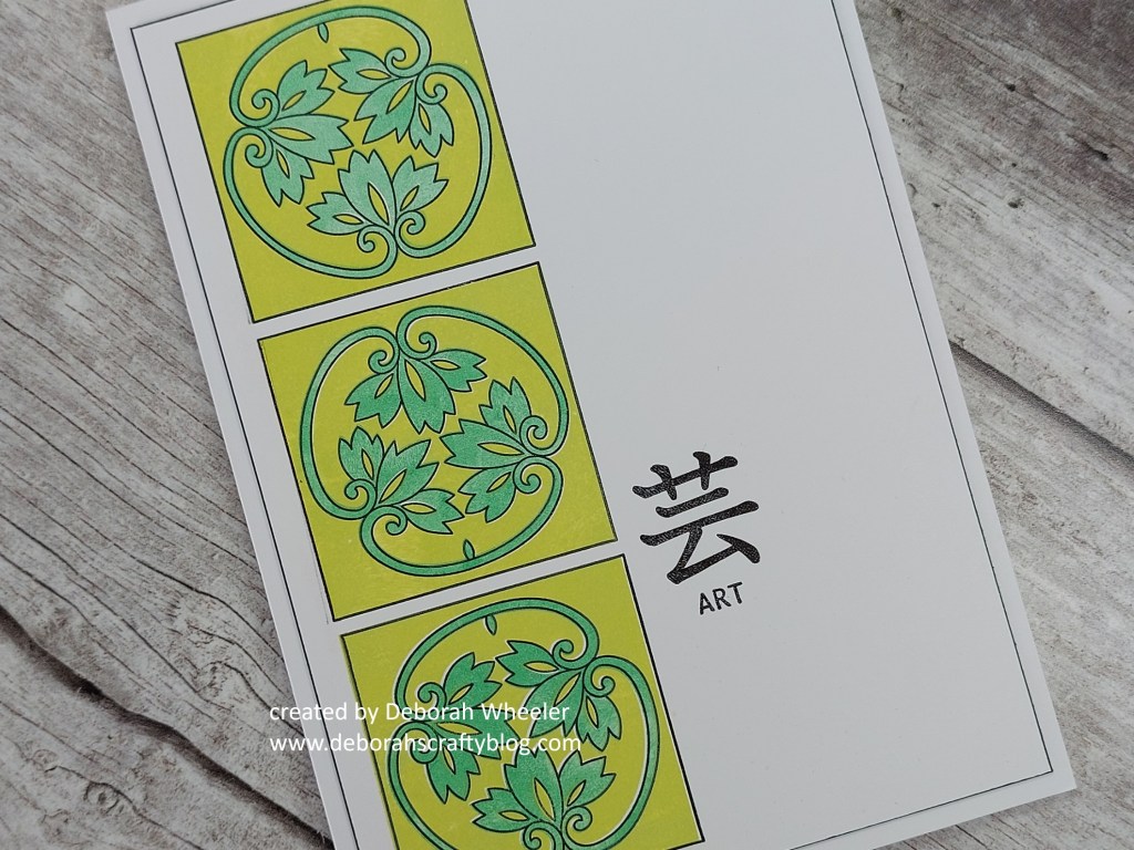
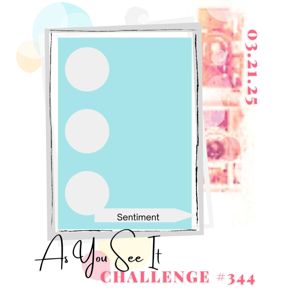
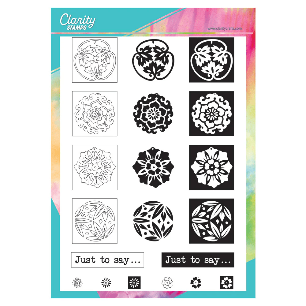
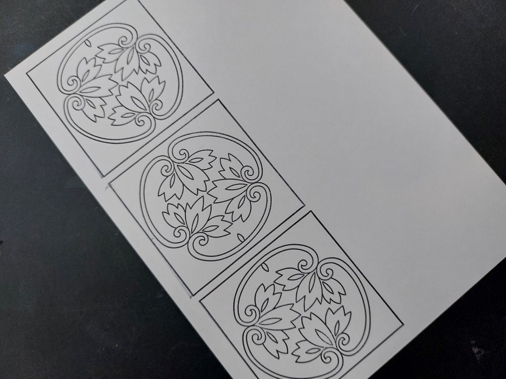
Hello and welcome to a couple of new things in today’s post! I shared a sneak peek yesterday of the new three-way overlay Japanese floral tiles stamps launching today from Clarity Crafts and they were ideal for our new sketch at As You See It (which I drew earlier this year!)Whilst I produced the sketch for AYSI, Barbara Gray drew these fabulous designs, based on old Japanese works of art.
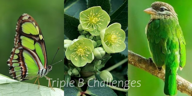
I’m still working through all the green challenges out there, so today I’ve pulled together Colorful Options and TripleB for the colours on my card.

I cut a piece of card to fit on a 5×7 card blank and started by stamping the outline
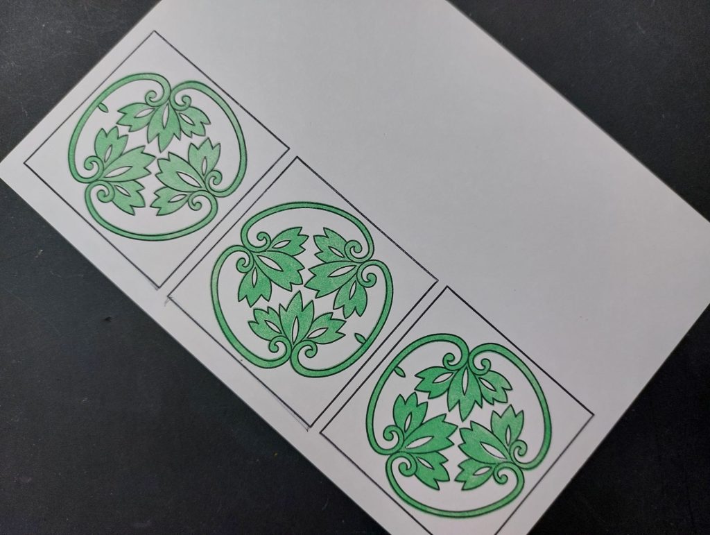
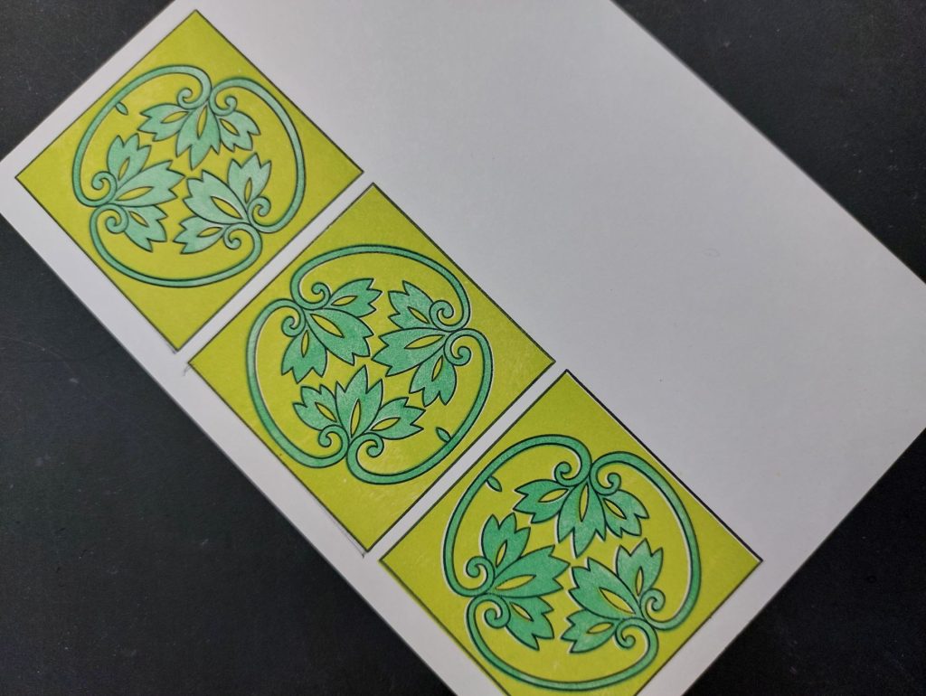
for the top image in the set – I rotated the middle one to break the pattern. I could then use the infill stamp to colour the floral images, using ‘lucky clover’ Distress Oxide – helpfully there’s a little notch one one side of the image which enables you to line up the infill stamp exactly with the outline. I then switched to ‘twisted citron’ which I sponged onto the background stamp to then fill in the rest of the tile.
I then simply added one of the ‘Japanese symbols‘ stamps and edged the topper with a black Sharpie. I glued scrap card onto the back of the topper before attaching it to the 5×7 card blank, which gave it a little dimension (and is a great way to use up offcuts!)
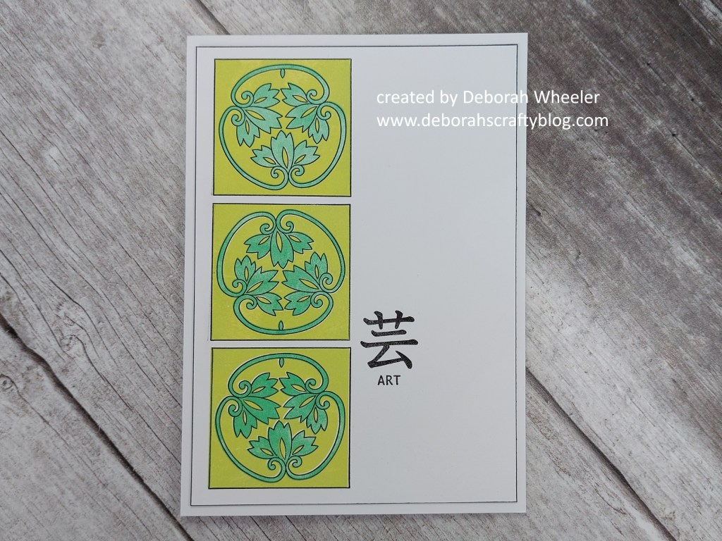
With all these Japanese-inspired stamps, I’ve been looking at the meaning of colours in Japanese culture. Green is popular and is regarded as a lucky colour (with a few others) – it’s used a lot in clothing and represents youth, vitality & energy. I need some of that, so maybe should start wearing more shades of green!
Discover more from Deborah's Crafty Blog
Subscribe to get the latest posts sent to your email.

Gorgeous! You are to CAS what I am to fun folds! 😉
LikeLiked by 1 person
ooh, praise indeed! 🥰
LikeLiked by 1 person
Really beautiful with the shades of green! Love the images!
LikeLiked by 1 person
thanks – they are rather fab!
LikeLike
Beautiful and I love how you used several greens to achieve the look.
LikeLiked by 1 person
thank you x
LikeLiked by 1 person
Lovely tones. Does this mean we have to get out of our black winter wear….?
LikeLiked by 1 person
well the sun has been shining and it is now officially spring…!!
LikeLiked by 1 person
True, very true xx
LikeLiked by 1 person
Well, this is a departure from your usual square-shaped creations, but then, I guess that’s what the sketch called for. However, you did sneak that square into the shapes that you stacked here as a background, so it’s not a complete abandonment! I love that you used this celtic design right around St. Patrick’s Day, too! A very effective take on the sketch, Deborah!
LikeLiked by 1 person
Thanks so much Heather x
LikeLike
I guess I should read more carefully. I guess they are Japanese stamps, but with the twining vines and green colours, they totally looked celtic to me. Sorry about that!
LikeLiked by 1 person
I know exactly what you mean!
LikeLike
💚💚💚 A gorgeous, minimalist beauty! Your tryptic of green and yellow are striking, and the simple “ART” sentiment is pure elegance. Thank you for playing with us at the Colorful Options Challenge. 💚🌈🙏 Hope you have a great week!🌟🖌️🎨 Cheers, Makira
LikeLiked by 1 person
thanks so much Makira x
LikeLike
So creative and pretty! Thanks so much for joining our challenge at Triple B.
Diane TB Co-Owner
LikeLiked by 1 person
Even with a special notch to help line things up, infill stamping is not easy. You’ve done a great job with it. Interesting that Heather saw Celtic – and I do see why – but I immediately saw oriental. The design is very crisp and elegant.
LikeLiked by 1 person
Thanks so much Jan x
LikeLike
Love the two greens working together to create your oriental panels Deborah. I don’t think of green as an oriental colour, but I love the effect. So calming!
LikeLiked by 1 person
thanks Joanne x
LikeLike