


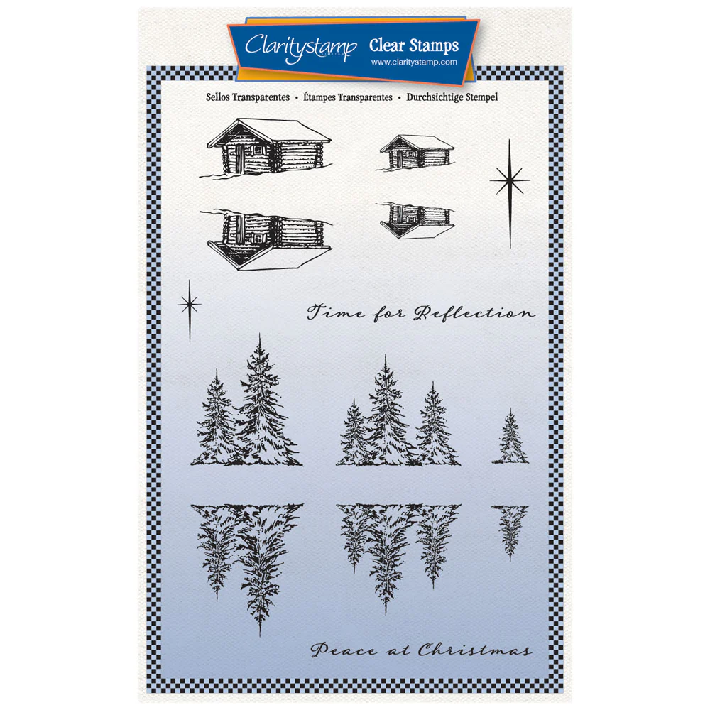
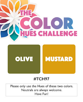
Hello everyone! I hope your week has started well – mine just keeps getting busier (I’ve got a very long ‘to do’ list…) I thought I’d take another look at ClarityCrafts‘ ‘winter cabin reflection’ stamp set, but put a twist on it with less than traditional colours thanks to Color Hues, although the layout from Freshly Made Sketches is less unexpected.

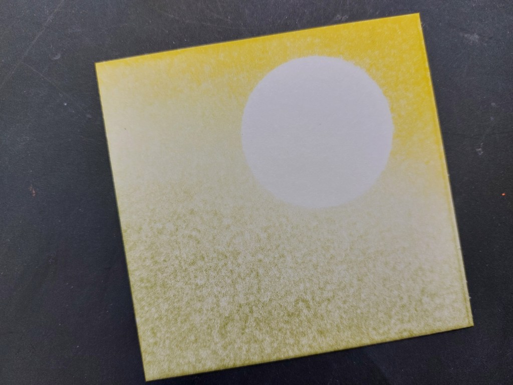
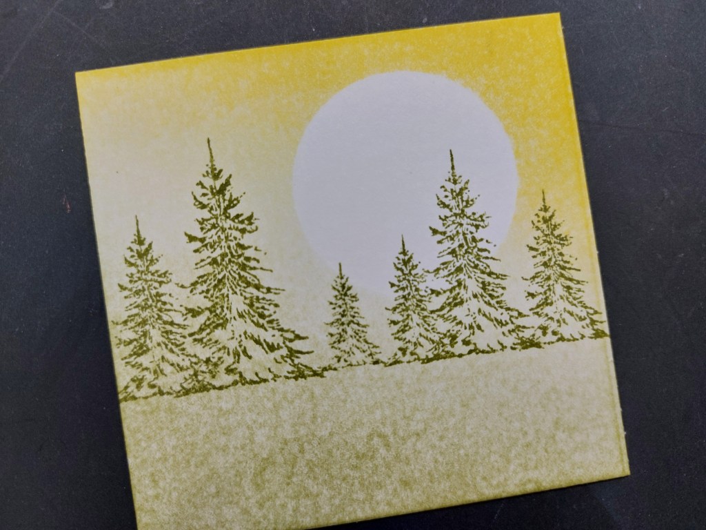
This one is pretty straightforward. I started with one of Clarity’s small stencil card squares, popped a moon mask onto it and brayered ‘mustard seed’ and ‘peeled paint’ Distress Inks across it. The ‘mustard seed’ pad was jucier than the ‘peeled paint’ – you can see that from the depth of colour. I stamped the row of trees across the centre using the ‘peeled paint’, then added the small single one into the gap.
I then simply added the eagle and little flock of brds from the ‘just woodland & birds’ set, followed by the sentiment from the ‘winter cabin’ set. I ran a black Sharpie around the card edges, embossed a frame onto a 5×5 card blank with a square embedder and attached the topper in the centre.

I’ve been busy today finishing my samples for next Sunday’s Clarity shows, which will be on YouTube from 3-5pm (UK time). Tomorrow, I’m onto my prep work for next week’s Clarity Open Days in Kent, where I and lots of the design team will be demonstrating – tickets are still availabe if you fancy a creative day out (or two!), just click on the link here for Friday 8th or here for Saturday 9th.
Discover more from Deborah's Crafty Blog
Subscribe to get the latest posts sent to your email.

Wow, what a gorgeous scene! Have a lovely week!
LikeLiked by 1 person
Thanks – you too!
LikeLike
Great title for this card. It really is peaceful and doing it in those colours make it quite unique.
LikeLiked by 1 person
Thank you Johanna
LikeLiked by 1 person
This came out beautifully, Deborah! What I really love is that the ink blending almost appears to have a texture to it. You are the queen of scenes that is for sure. Thanks for sharing with us at Color Hues!
LikeLiked by 1 person
Thanks so much Nancy
LikeLike
Really is so peaceful, Deborah xoxo
LikeLike
thank you Em x
LikeLike
This is indeed a peaceful scene and quite a versatile layout, change the colours and you’d get a totally different look. Thanks for taking the Color Hues colours and running with them! 🙂
LikeLiked by 1 person
Oh, this is peaceful for sure! I love it!
LikeLiked by 1 person
Thanks so much!
LikeLiked by 1 person
Your stamping and coloring are amazing. It really does give off peaceful vibes. Thanks so much for playing with my colors at Color Hues!
LikeLiked by 1 person
Beautiful card and love the colours. Can you tell me how you created the lower green area? Did you use a brush? Many thanks
LikeLiked by 1 person
Thank you Jane. Yes, I used Clarity’s stencil brushes, sweeping across from side to side over the stencil. Hope that helps x
LikeLike
Thank you Deborah.
LikeLiked by 1 person
Lovely – perfect for those colours xx
LikeLiked by 1 person
thanks so much Lynda x
LikeLike