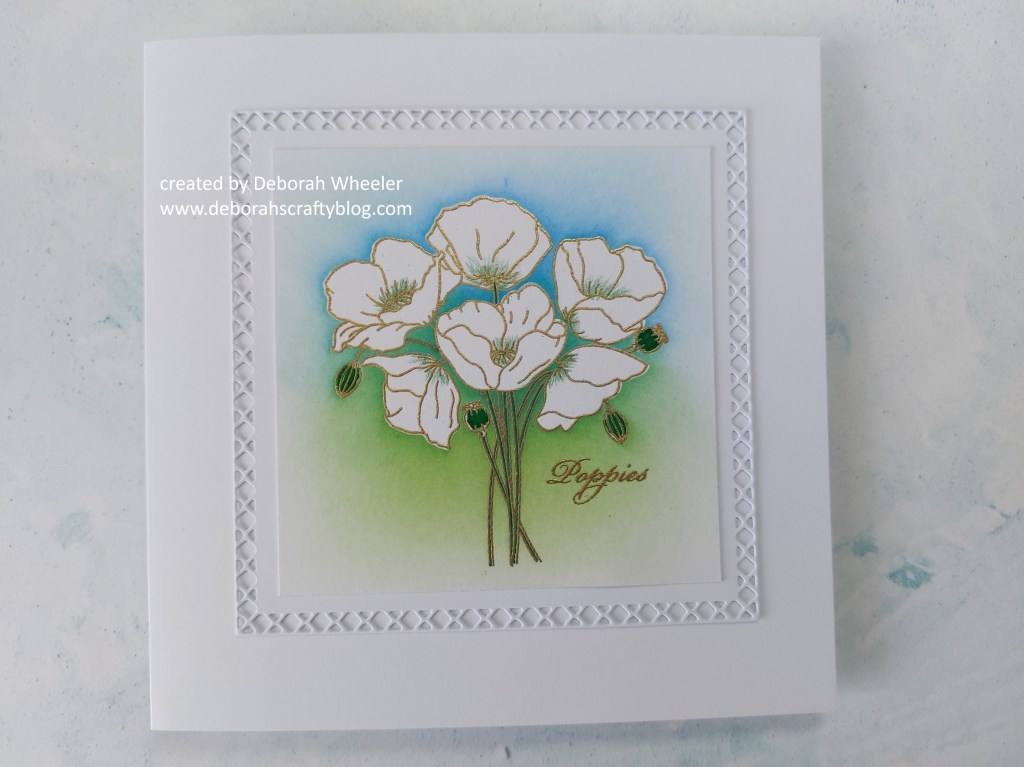
Hello there! It’s time for our next challenge at As You See It and I got to pick the colours for this one! What do you think of this palette? I used it with the new ‘poppies’ stamp from Linda’s Florals collection by ClarityCrafts, focusing the colours into the background. This is the final one of my samples from last weekend’s shows and I’m also going to share it with Make My Monday, where the challenge is to make your own backgound.


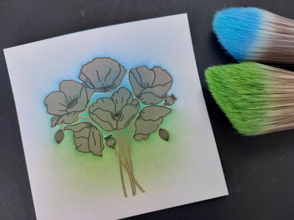
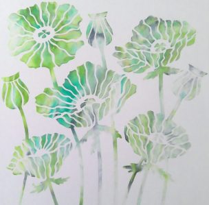
The first step was to stamp the bunch of poppies onto a square of card and heat meboss it with WOW’s gold metallic superfine powder. I then covered the flowers with the pre-cut masks that come with the stamps and brushed ‘broken china’ and ‘mowed lawn’ Distress Oxides into the background, starting both colours from the centre and sweeping outwards.


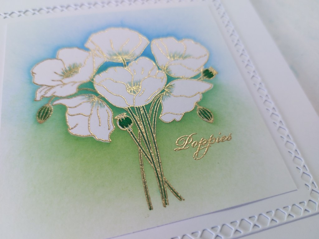
I lifted the masks off (they go back on the carrier sheet for next time!), I used a green Pergaliner pencil to shade in the centres of the flowers and a green Pergacolour pen to pick out the pods and the stems.

I heat embossed the ‘poppies’ sentiment onto the topper, then popped it onto a white mount cut with one of the ‘lattice’ nested doodle frame-it panel dies and attached it to a 6×6 card blank.


I do love these colours (which is obviously why I chose them!) and they make a great impact against the white poppies. Come and join us at As You See It – we’d love to see how you use them.
Discover more from Deborah's Crafty Blog
Subscribe to get the latest posts sent to your email.


Love it all. The colours are so pretty behind the florals.
LikeLiked by 1 person
Thank you xx
LikeLiked by 1 person
So pretty! I absolutely LOVE the color palette!
LikeLiked by 1 person
Thanks!!
LikeLiked by 1 person
Wowza, Deb, this came out gorgeous, and such a beautiful take on your excellent color challenge! I’m in awe of those masks – brilliant! Way to go, teamie! (And thanks so much for playing at Make My Monday, lol!)
LikeLiked by 1 person
Thanks so much Heather!! 🥰
LikeLike
So beautiful! Love the cross stitch details along the edge too!
LikeLiked by 1 person
Thank you!
LikeLike
Fabulous! Love the white blooms against the sponged background – perfect! Interesting to read that the set comes with masks. Now that’s a great idea!
LikeLiked by 1 person
Thanks so much Jan – the masks do make life a whole lot easier!!
LikeLike
This is just beautiful Deborah – using the colours to blend behind your bright white flowers is so clever and makes for a stunning display. A fabulous use of your chosen palette this week!
LikeLiked by 1 person
Thanks so much Joanne x
LikeLike
This is lovely, Deborah! That gold embossing really creates an effective outline! And the blending and pencil colouring create such beautiful but contained colour, so that the bright white is highlighted. Love it!
LikeLiked by 1 person
Thanks so much Heather x
LikeLike
Just lovely xx
LikeLiked by 1 person
thanks Lynda x
LikeLike