

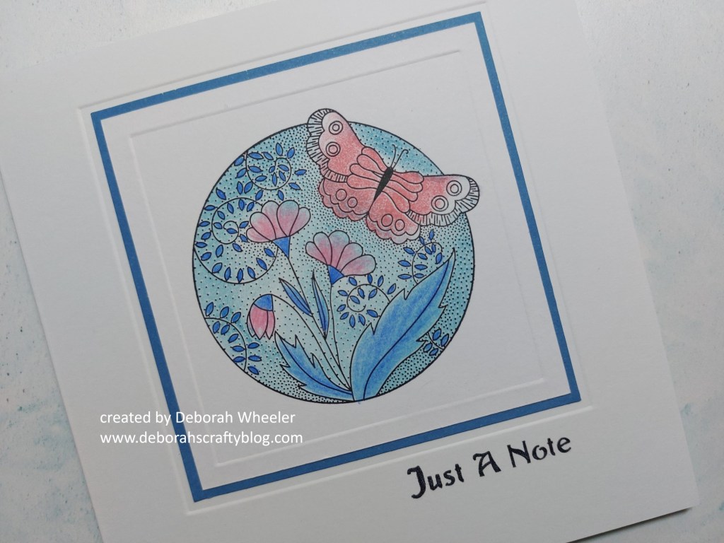
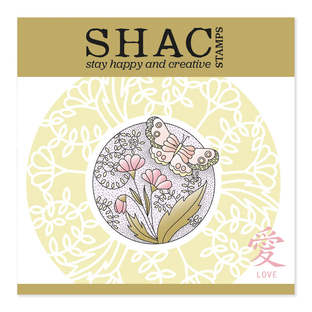
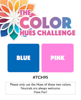
Hello there! I’ve got another of my favourite stamp sets to share with you today – the ‘SHAC Love Japanese flowers & butterflies’, which I’ve combined with one of my favourite colour schemes, the pink & blue from Color Hues and the theme from Addicted to CAS

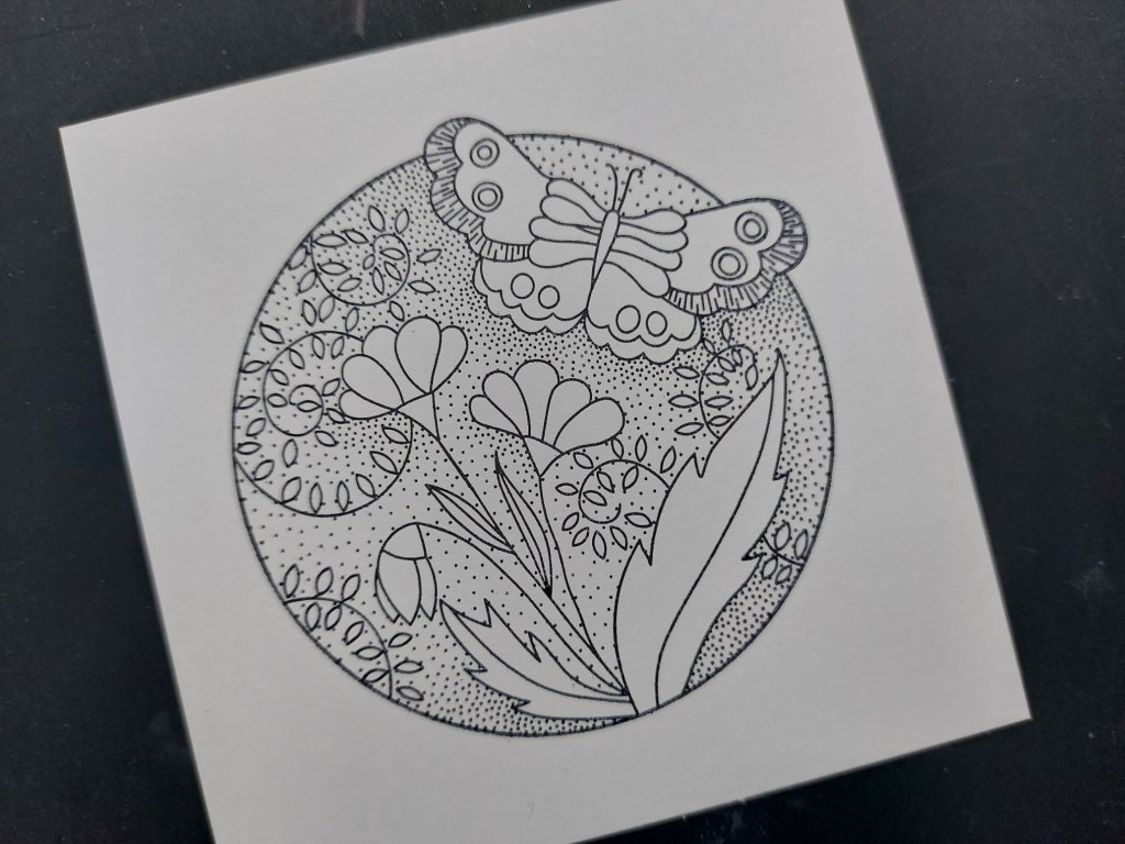
This is another of Clarity’s two-way overlay sets, with an outline image and a matching infill stamp for the background. I started by stamping the outline with black Archival ink ono a small square of stencil card, then sponged ‘broken china’ Distress Ink onto the infill (avoiding the butterfly and the flowers) and stamped that into place. With these stamps, I find it easiest to line the dry infill stamp up on the outline first and then pick it up on a mount – you know you’ve got it fully lines up when the image is nicely in focus. Having stamped the background, I pulled out the separate butterfly infill stamp, sponged ‘worn lipstick’ Distress Ink onto it and added that to the card (having lined it up first in the same way as the background).

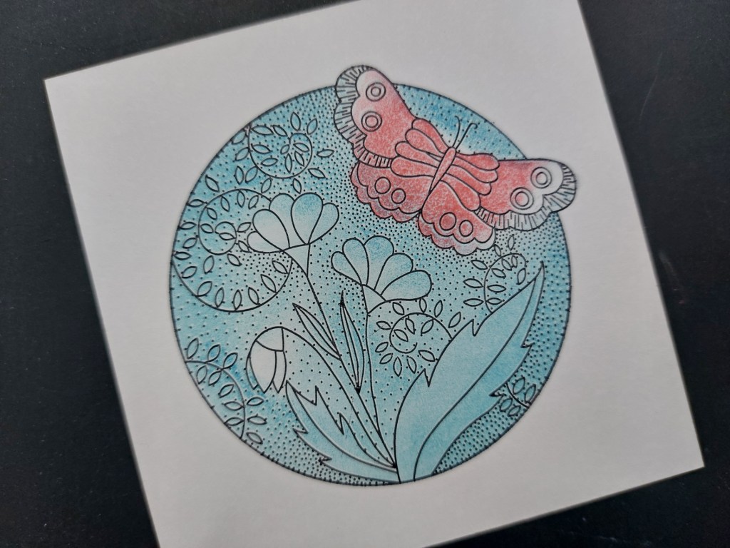
I used pink & blue Pergaliner pencils to add more colour to the flowers and leaves, plus a micron pen to fill in the butterfly’s body, then sued a small square embedder to emboss a frame around the image.
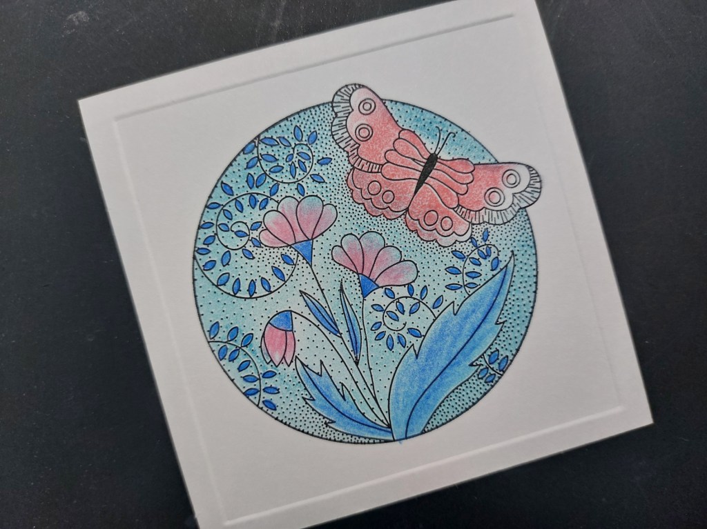
I embossed a second frame with a larger embedder onto the front of a 6×6 card blank, mounted the topper on a piece of Waimea Falls companion paper and attached it to the card. I finished with a phrase from the ‘essentials sentiments’ set

This does feel like a last glimpse of summer with these pretty colours!
Discover more from Deborah's Crafty Blog
Subscribe to get the latest posts sent to your email.

You really are a master of CAS cards. This is so pretty.
LikeLiked by 1 person
Thanks so much!
LikeLiked by 1 person
So pretty!
LikeLiked by 1 person
Thanks Leslie x
LikeLiked by 1 person
So pretty, Deborah xoxo
LikeLiked by 1 person
thanks Em x
LikeLike
Deborah, your card is stunning yet soft like a breath of fresh air. I love thinking it’s a last tribute to summer. Your colors are beautiful, love this! We are so glad you joined us at Color Hues!
LikeLiked by 1 person
Beautiful card, I really love how you did the framing/embossing! Thank you for playing along with us at Addicted to CAS!
LikeLiked by 1 person
Thanks Melanie x
LikeLike
Absolutely BEAUTIFUL card Deborah and definitely a wonderful tribute to the last days of Summer! Thanks so much for sharing this lovely, lovely card with us at Color Hues!! Marcia (DT)
LikeLiked by 1 person
It’s beautiful! Love the layout!
LikeLiked by 1 person
Thanks so much x
LikeLike
Another signature layout and beautiful card, Deborah. I love that image! Thanks for joining us at Color Hues.
LikeLiked by 1 person
Thank you Nancy x
LikeLiked by 1 person
Gorgeous – those colours work really well for this image xx
LikeLiked by 1 person
Thanks Lynda x
LikeLike