


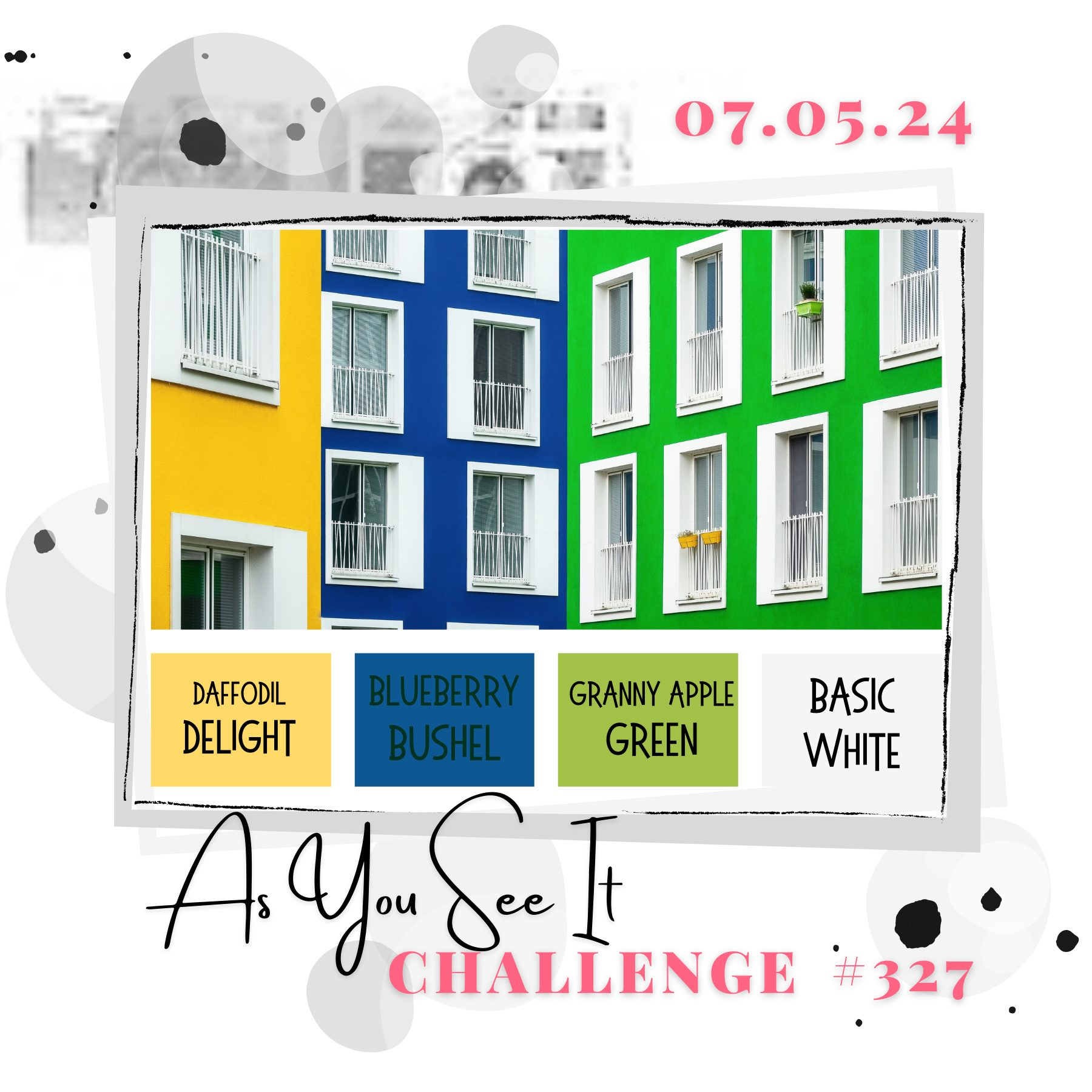
Welcome to Friday’s blog – nearly time for the weekend! Before we get there, though, we’ve got a new challenge for you over at As You See It and it’s a colour palette that I’ve chosen for you! And I just had to use the ‘town’ three-way overlay stamp set from ClarityCrafts, given the inspiration photo I found.
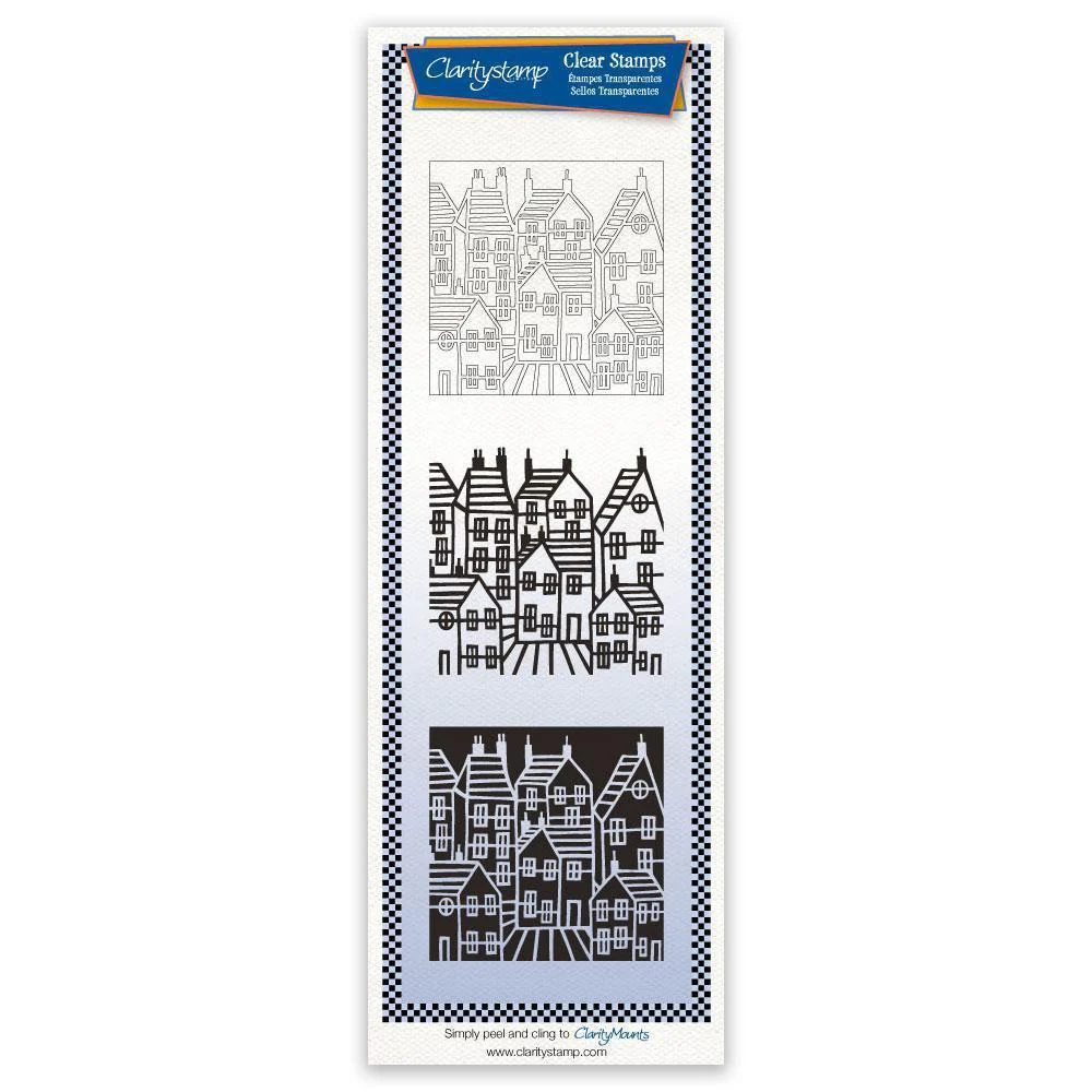
I started with a small square of stencil card and used the outline (stamp 1) with black Archival ink to give me the line image. I then went to stamp 3, the background one, and sponged ‘mustard seed’, ‘blueprint sketch’ and ‘mowed lawn’ Distress Oxides onto it to colour the various houses. I didn’t use stamp 2, which would colour in the outline of the houses, to keep the contrast of the white.

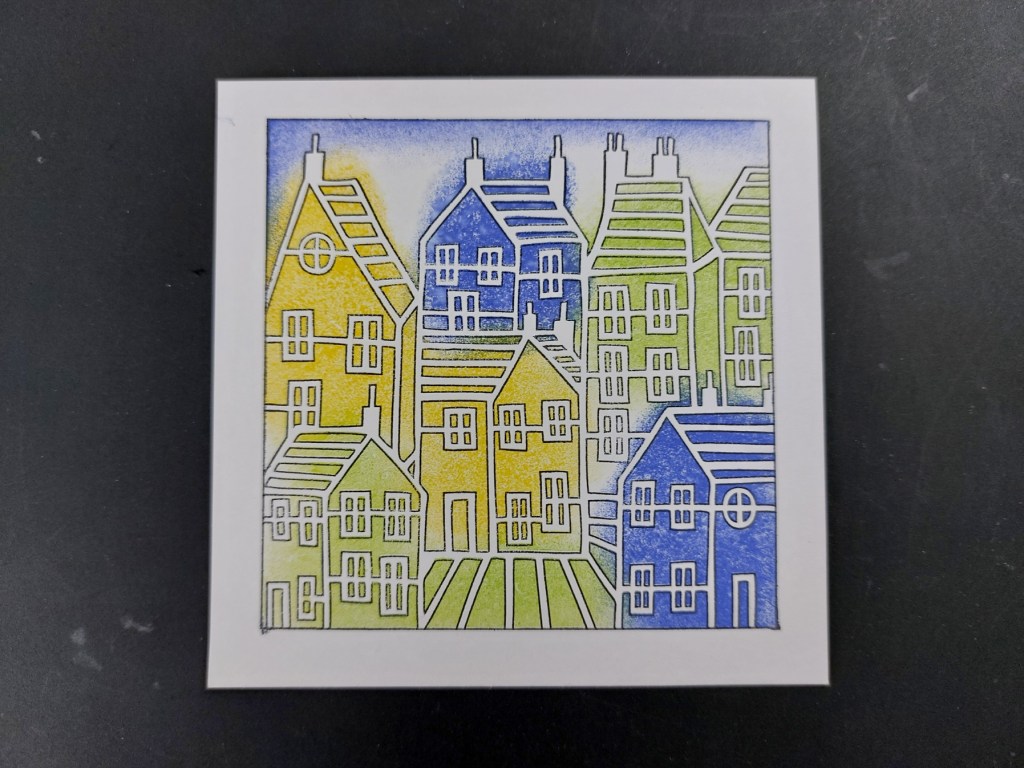
I used a square embedder to create a frame on the front of a 6×6 card blank, ran a black Sharpie around the edges of the topper and attached it into the frame. The final touch was one of Clarity’s new Pinky Gray greetings stikcers, which I also edged with the Sharpie before attaching it.

I’ve got a few friends who will be moving house soon, so this will come in very useful! Come and join us at As You See It – there’s more inspiration from my team-mates over on the blog & we’d love to see how you use our colours. Meanwhile, I’m going to share this with Addicted to Stamps for their ‘make your mark’ challenge, using inks, pencils, markers, etc.

Discover more from Deborah's Crafty Blog
Subscribe to get the latest posts sent to your email.

Very cool card! I like those products you used!
LikeLiked by 1 person
Thanks!
LikeLiked by 1 person
Love the modern look and colours in this one!! 🙂
LikeLiked by 1 person
Thanks so much Helen x
LikeLike
So beautiful with the different colored background! Nicely done!
LikeLiked by 1 person
Thanks!
LikeLike
Those houses look so cheerful and this is a great new home card.
LikeLiked by 1 person
Thanks. I do like this stamp set
LikeLiked by 1 person
How lovely is this cityscape? You’ve certainly taken the challenge graphic to heart on this one. I like this one a lot, Deborah. 🙂
LikeLiked by 1 person
Thanks so much Jan x
LikeLike
I don’t know if you got to Newfoundland on your recent Canadian trip, Deb, but this card reminds me of the colourful, tall houses that you find in some cities and towns on “The Rock”. It looks so homey and cheerful!
LikeLiked by 1 person
Thanks Heather! We didn’t get that far east – one for a future trip maybe!
LikeLike
Welcome back Deborah – you’ve been missed! Your colourful houses remind me of a Michael Powell painting – and look a lot like the inspo photo too! A great job with this week’s colour palette.
LikeLiked by 1 person
Thank you!
LikeLike