

Hello crafty friends – lots going on today! ClarityCrafts‘ Barbara Gray was back on screen today to launch the fabulous ‘butterflies & bees’ stamp set (together with a new die and collage papers), plus we’ve got a new challenge at As You See It! Now the bees are right in my happy place (‘Deborah’ means industrious or bee-like!) – a total contrast from AYSI’s challenge to feature the colour we use least… Serendipity is a wonderful thing, though, as I don’t use much brown on my cards (especially with yellow) but that’s perfect for the bees!

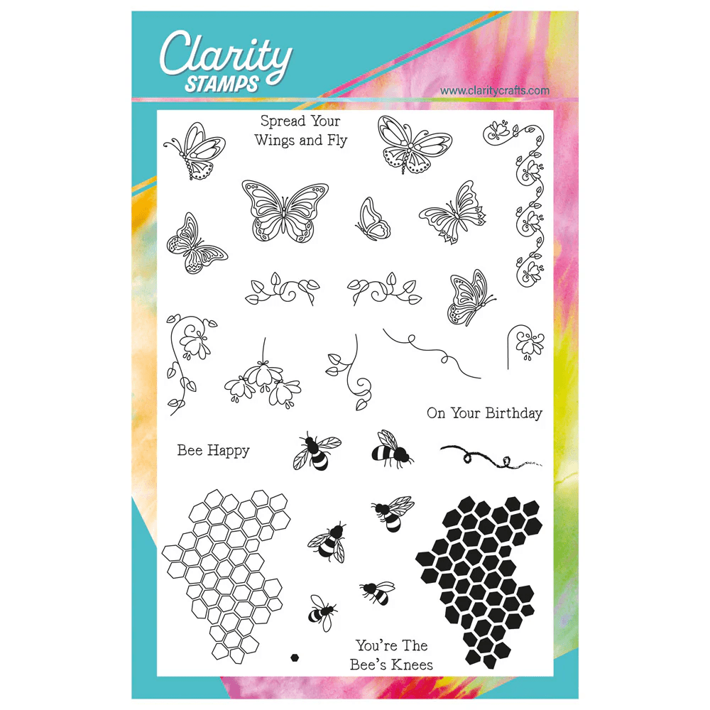
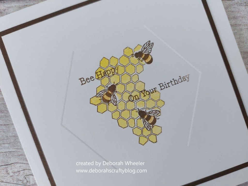
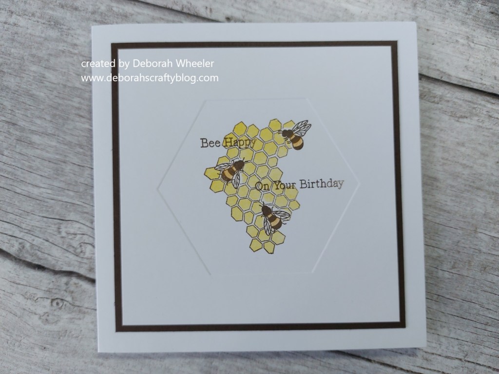
I decided to break out one of the hexagon embedders (I hadn’t used them til now) to make a frame on half a 5×5 card blank. I sat the honeycomb stamp (uninked!) in the centre and made some pencil registration marks so I got my bees in the right place. On went the three little bees, using ‘potting soil’ Archival ink. I cut masks for them from Clarity’s mask material, covered them over and stamped the honeycomb outline, also with the ‘potting soil’, then sponged ‘mustard seed’ Distress ink onto the honeycomb infill stamp and added that too.

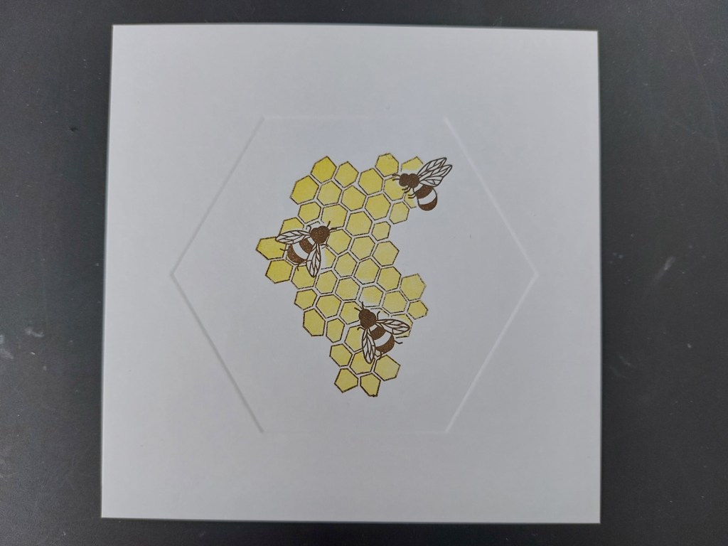
Having removed the masks, I added a little colour to the bees with a Pergaliner pencil, then stamped the sentiments, again in ‘potting soil’. I finished with a layer of brown card and attached the whole piece to a 6×6 card blank. Bit of a contrast in style to this morning’s offering!
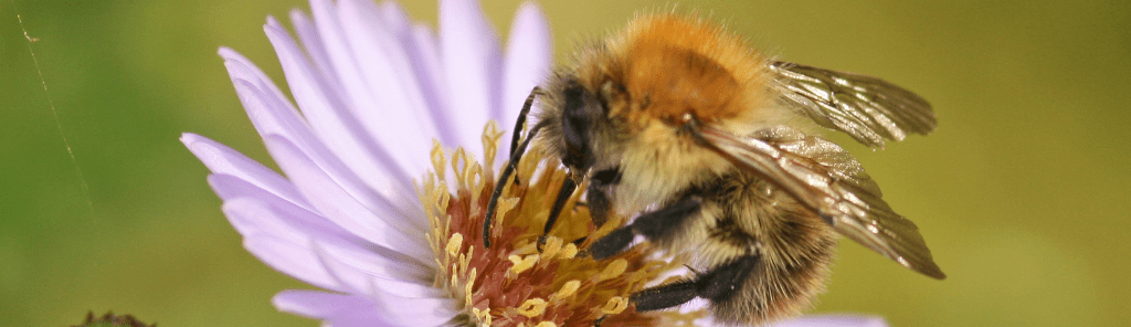
Now you know I love a fun fact! Well, it turns out there are brown bees in the UK, not just the more common black & yellow ones! According to the London Wildlife Trust, the common carder bee is a fluffy, gingery bumblebee that’s found in gardens and woods – and here’s a little pic
So why don’t you dust off the colours you use least and come and share them with us at As You See It!
Discover more from Deborah's Crafty Blog
Subscribe to get the latest posts sent to your email.

Great use of the dies – and the colour you least use. xx
LikeLiked by 1 person
thanks Lynda!
LikeLike
So effective with the black contrast.
LikeLiked by 1 person
Brown is my least favoured colour also. I don’t use it much at all. I do however, like how you’ve used it in your card. Beautiful end result.
LikeLiked by 1 person
Thank you – it was a lucky break with the bees stamps also launching today!
LikeLiked by 1 person
Even though infrequently used, it looks amazing! Great card!
LikeLiked by 1 person
Thank you!
LikeLiked by 1 person
I like the clean look of your card, Deborah and the clever way you’ve created the honeycomb and bees. I like browns, especially rich dark ones. Funny how we have our little preferences, isn’t it. Also funny how you can dislike a colour, yet still like a project made using it. 🙂
LikeLiked by 1 person
That’s true Jan!
LikeLike
I don’t often use brown as an outline colour but I love the way you’ve used it here Deborah – it compliments the yellow beautifully! I must try it. I love the embedded frame too – it brings your design together beautifully.
LikeLiked by 1 person
Thanks so much Joanne xx
LikeLike
Great job masking and stamping, Deb! Very precise work. You’ve chosen the right colours of brown and yellow to work together, to give a warm feel to your subject! I don’t mind brown, and I should use it for an outline more often.
LikeLiked by 1 person
thanks so much Heather xx
LikeLike