


Hello there! You won’t be surprised to hear that I did a bit of shopping at ClarityCrafts‘ Open Day on Saturday, so I thought I’d better start putting some of the goodies to use. Today’s card uses a new stamp set that Clarity only launched a couple of weeks ago and I’m having another go at stencilling in the background too. I took the colours from the current palette at Color Hues and used the sketch at TGIF for my layout.


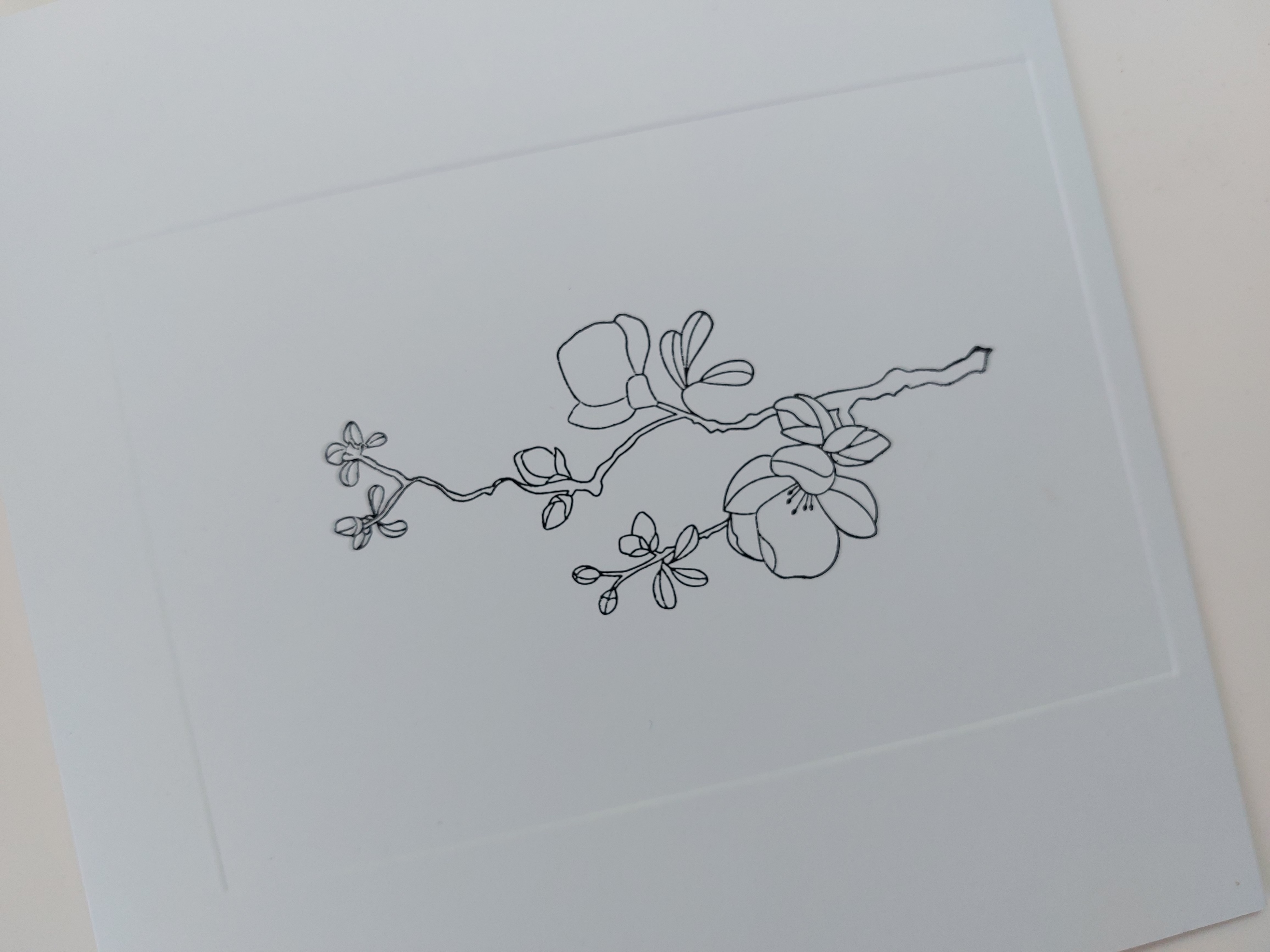
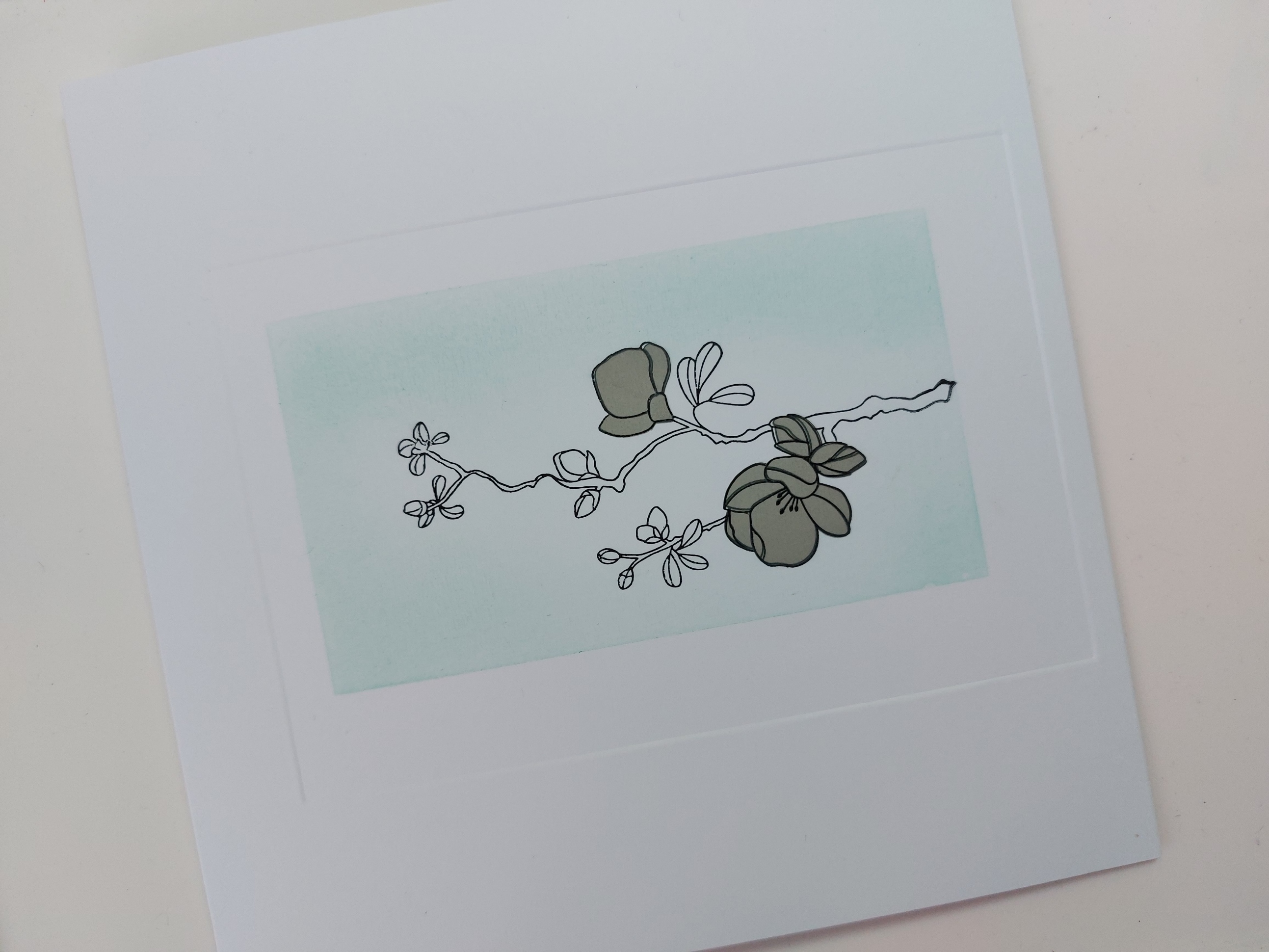
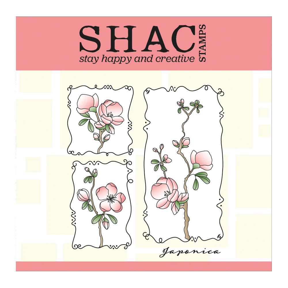
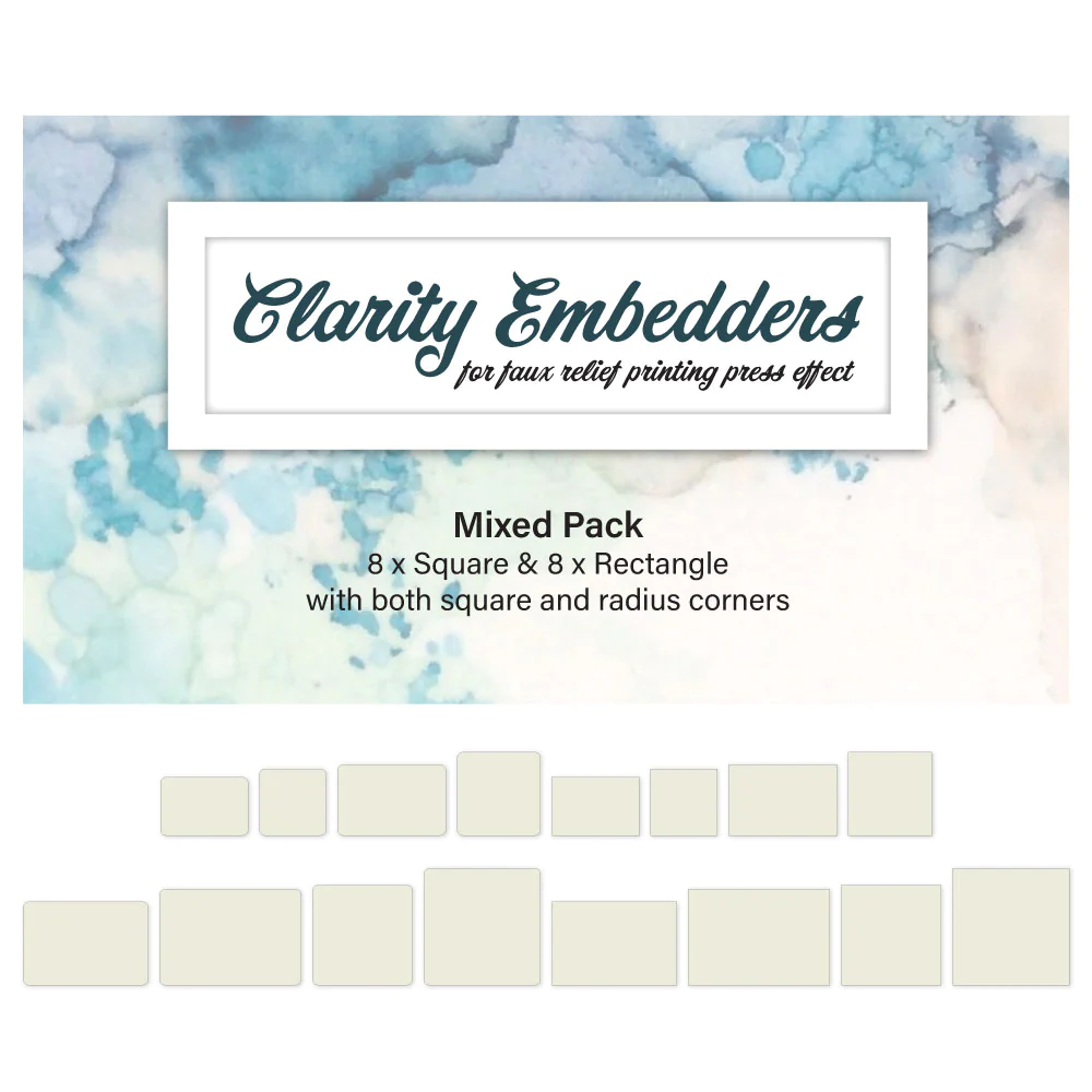
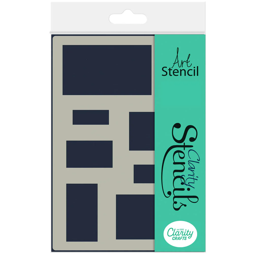
I started with a 7×7 card blank and used one of the rectangle embedders to create the frame on the front. I stamped the long japonica bough into the frame and then used two of the pre-cut masks that come with the set to cover the large blossoms. I laid the ‘rectangle aperture mat’ A4 stencil onto the card from so that the largest rectangle sat over the bough and masked it off around the sides with low tack tape. I then brushed ‘salvaged patina’ Distress Oxide through it, keeping the ink towards the outer edges and leaving the centre clear.
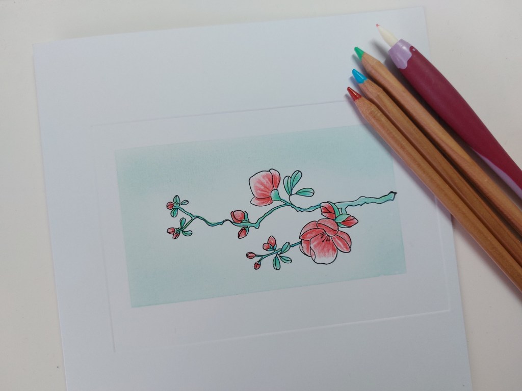
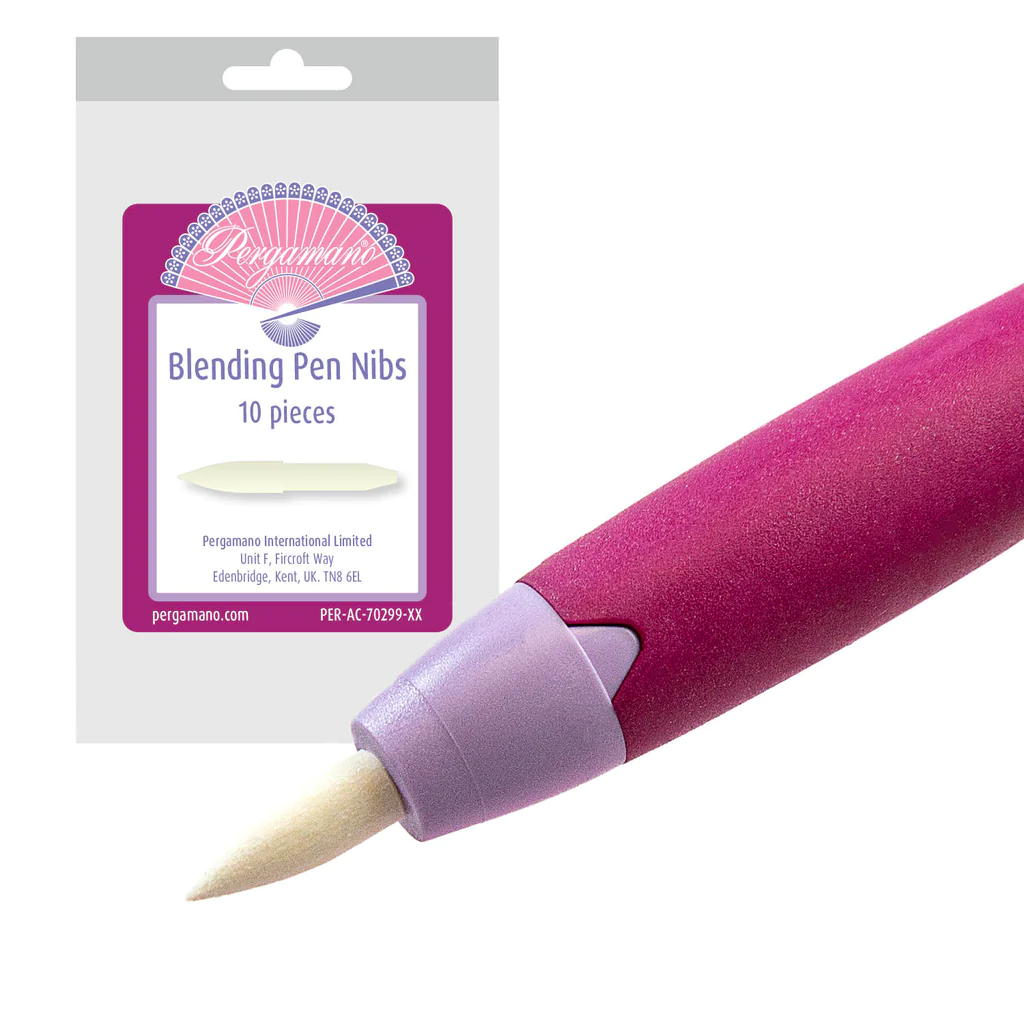
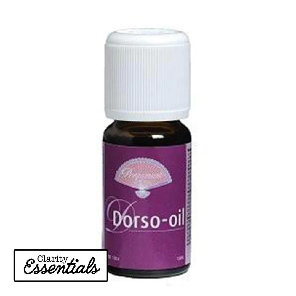
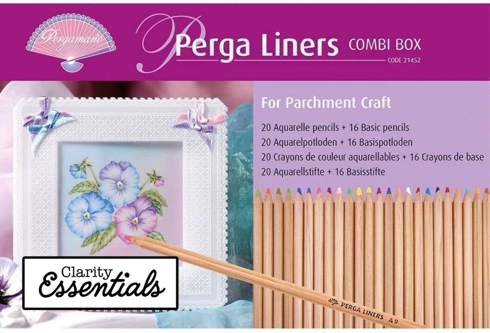
The next step was to use Pergaliner pencils to shade in the blossoms, leaves & branch. I used the red (B11) for the blossoms, blending it out with a Pergamano nib and a little Dorso oil (first time I’ve tried this after seeing Barbara Gray demo it on the telly!) I didn’t have the right shade of aqua for the leaves and branches so used two colours, putting down an undercoat of the turquoise (B16) and blending the light green (A13) over the top, which worked really well.
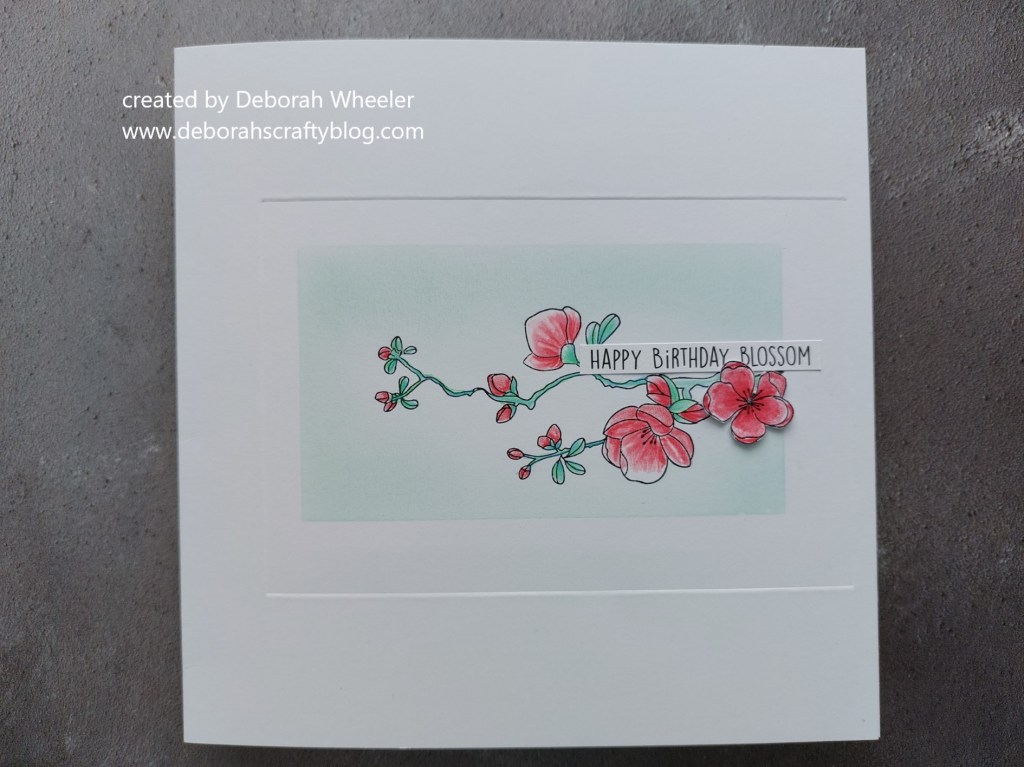
I’d stamped the medium image from the set separately and coloured in the main flower in the same way as I’d done those on the card. I then fussy cut it and glued it into place to sit below one of the KISS word stickers.
It’s been another hot day here in North East London – we did have a short storm this afternoon but, even so, these blossoms are looking a lot fresher than the flowers in my garden!
And here is a quick summary of the main products I used on my card
Discover more from Deborah's Crafty Blog
Subscribe to get the latest posts sent to your email.

Love that stamp and that you made your own color of turquoise
LikeLiked by 1 person
Thanks!
LikeLiked by 1 person
This is so lovely! The CAS design is perfect for the florals which you have colored beautifully! Thanks for sharing with us at Color Hues!
LikeLiked by 1 person
Thank you!
LikeLike
Absolutely amazing Japonica and CAS design x
LikeLiked by 1 person
Thank you Annie xx
LikeLike
CAS at it’s finest, Deborah! Just as lovely as can be! Thanks for joining us at Color Hues!
LikeLiked by 1 person
Thanks Nanc’!
LikeLike
Beautiful in every aspect! Love the color palette and of course, the CAS design!
LikeLiked by 1 person
Thank you! Xx
LikeLike
Love the debossed frame for your pretty blossom sprig, super CAS too. It’s still too hot here though at least we could open the windows in the evening yesterday after 3 days of thunderstorms. Thanks for embracing the colours at Colour Hues. 🙂
LikeLiked by 1 person
Thank you! It’s not as hot here now so life is a but more comfortable!
LikeLike
I’m very envious of your pencil coloring. It’s certainly a talent I have yet to master. This is just so soft and beautiful. Thanks so much for playing with us at the Color Hues challenge!
LikeLiked by 1 person
Thanks so much Julie!
LikeLike