

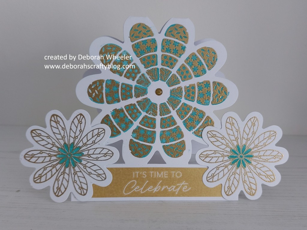
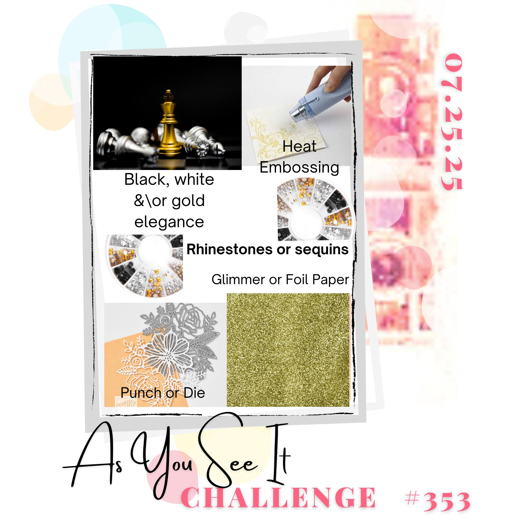
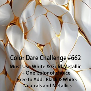
Hello again. I’ve got a second card here to share with you, this time a variation on a demo from this afternoon’s 2pm Clarity Social TV and inspired by our new recipe challenge at As You See It, together with the ’embossing’ theme at Make My Monday and the new palette of white & gold metallic plus one other colour from Color Dare.
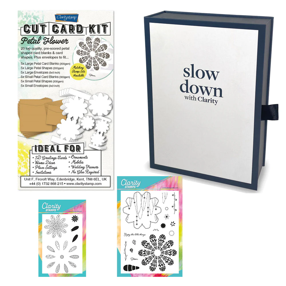
I’ve used Clarity’s petal flower cut card kit, with these lovely die cut blanks and matching stamps. My first step was to take one of the large card blanks, stamp the flower image onto it with Versamark clear ink and then heat embossing it with WOW’s gold powder. I then switched to the solid petal infill stamp and added ‘peacock feathers’ Distress Oxide to each of the petals in turn. Top tip – once you’ve finished inking, blot the image with a piece of kitchen towel, to lift any ink residue off the heat embossing and prevent smudges…!

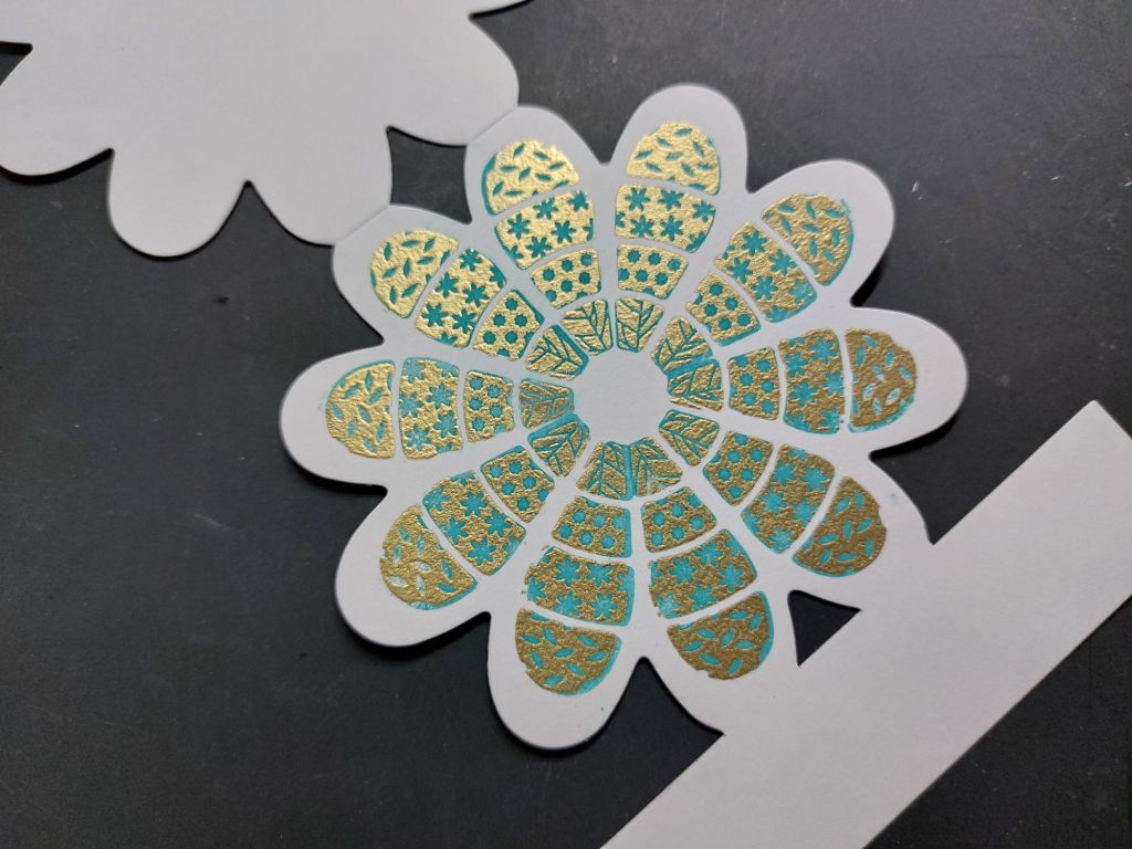
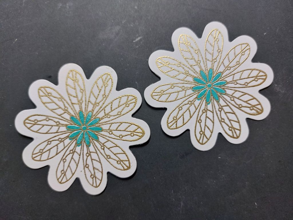
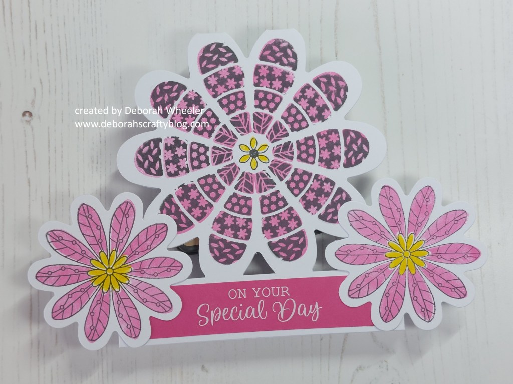
Next, I took two of the small die cut toppers and again stamped the co-ordinating image onto them before heat embossing in gold. This time, rather than fill in the whole petal, I opted to just use the ‘peacock feathers’ on the small centre stamp.
I was then on to assembly. I cut a piece of a lovely gold shimmery card I’ve had for ages and glued it onto the base of the petal card blank, before adding one of the white all occasions rub on sentiments. I could then glue the die cut toppers onto either side of the base before finishing with a shimmery gold dot in the centre of the large flower.
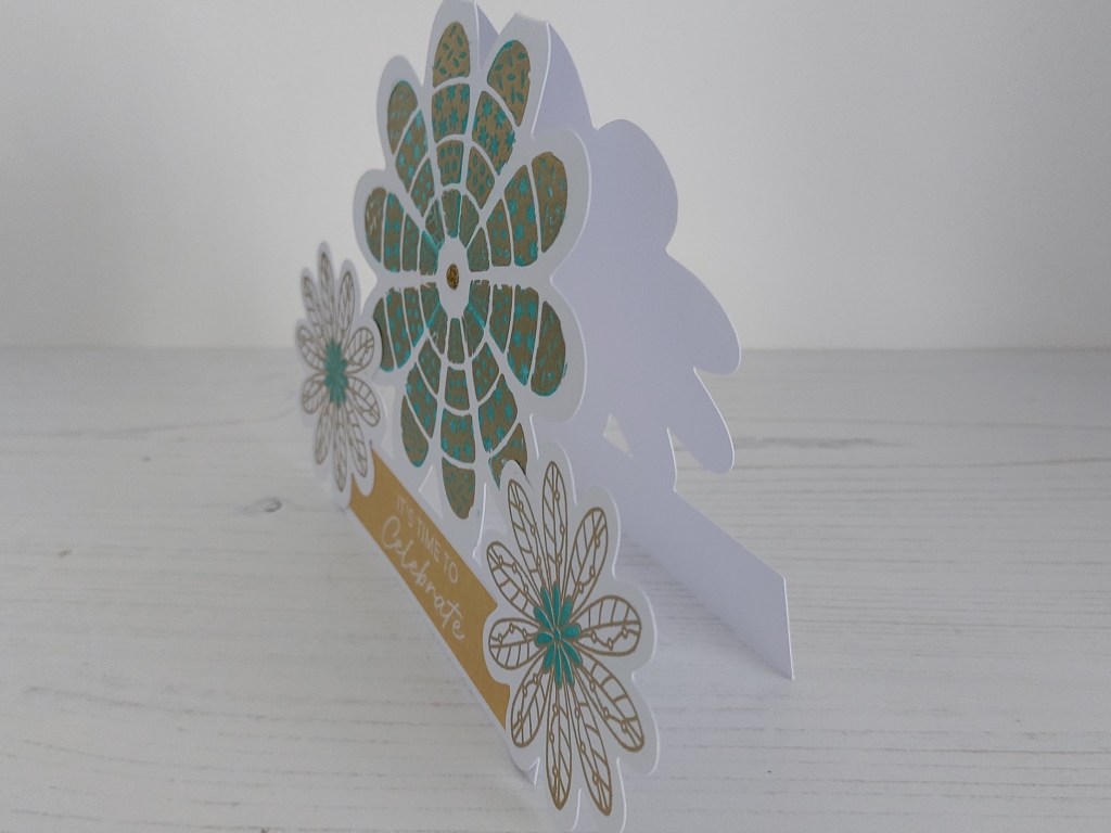
So, to check through our recipe at As You See It – I’ve gone gold & white on the card (hopefully you think it’s elegant…), obviously heat embossing, a rhinestone in the centre of the flower, die cut card toppers (that may be cheating a little bit!) and finally the gold shimmer card across the base. Job done!
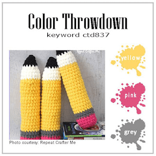
And here’s a look at the actual card I demo’d this afternoon – it’s the same design, but without the heat embossing and using the colours from Color Throwdown. I went with ‘watering can’ Archival ink, ‘picked raspberry’ & ‘mustard seed’ Distress Inks and a piece of Waimea Falls companion paper.
Discover more from Deborah's Crafty Blog
Subscribe to get the latest posts sent to your email.

True elegance and an interesting shaped card. You nailed it!
LikeLiked by 1 person
thanks so much!
LikeLiked by 1 person
How fun is a shaped card?! I love them almost as much as a fun fold!
LikeLiked by 1 person
I’m getting better with them…!
LikeLiked by 1 person
Definitely elegant, and the colours work well with the design. xx
LikeLiked by 1 person
Thanks Lynda x
LikeLike
What a fun kit! Love the way you’ve showed us the same thing in two completely different looks.
LikeLiked by 1 person
thanks so much Jan x
LikeLike
Love this shaped card!! So much fun!! So happy you shared with us at Color Dare!!
LikeLiked by 1 person
What a cool shape for a card! Thanks for joining us at Color Throwdown!
LikeLiked by 1 person
Deborah, I don’t think I realized at first that this was a shaped card, but that just adds to it’s awesomeness! And then you made two in different colour combos! So cool! Definitely lots of the elegance factor!
LikeLiked by 1 person
Thanks so much Heather xx
LikeLike
Great job on your white and metallic gold images, and your choice of blue is striking. Thanks for sharing your beautiful card with us at Color Dare.
LikeLiked by 1 person
What a fab shaped card Deborah – so unusual and so elegant in the white and gold with a pop of teal – gorgeous!
LikeLiked by 1 person
thanks so much Joanne x
LikeLike
What a fabulous, unique shaped card! And perfect with the teal added to the white & gold. Thank you for sharing at Color Dare.
LikeLiked by 2 people