


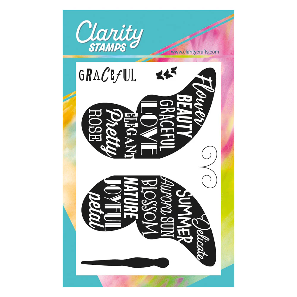
Hello crafty friends. I’m back with another of my demos from last Friday’s Clarity Social TV, this time using the large graceful butterfly stamp and the colours from Color Dare. This one has got a fab collection of words on it (not just graceful) and makes a great impact on a card.

Starting with a 4.25″ square of card, I used my stencil brushes to blend ‘saltwater taffy’, ‘mustard seed’ and ‘twisted citron’ Distress Oxides together for my background.The colour gradient between the ‘mustard seed’ and ‘twisted citron’ is more subtle than Id hoped for!

Anyway, having decided I could live with the colours, I positioned both wings onto my card so I could pick them up on one of Clarity’s mega mounts in order to stamp them at the same time. I inked them up with a combination of black Archival first and then Versafine Clair to deepen the black and stamped them onto the stopper. I then added the butterfly’s body and antennae into the centre.

This is quite an intense image and I just wanted to break it up a little for interest, so I cut the topper into four tiles and mounted them on a square of black card, before attaching it to a 6×6 card blank. This would work equally well cut into offset rather than regular tiles too.
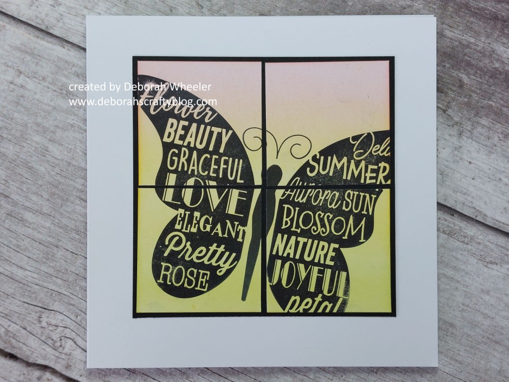
With everything on the butterfly’s wings, I decided it didn’t need a sentiment this time. Paul said to me on the show that it seemed like you were looking at it through a window – hopefully one that the butterfly’s not flown straight into, though!
Discover more from Deborah's Crafty Blog
Subscribe to get the latest posts sent to your email.

Just beautiful! And yes, that’s a large butterfly! 😉
LikeLiked by 1 person
Thanks!!
LikeLiked by 1 person
The word butterfly really pops against your pastel colored background. Thanks for sharing your pretty card with us at Color Dare.
LikeLiked by 1 person
What a fabulous image/sentiment you’ve used. Love the soft CAS use of the challenge colors. Thank you for playing with us at Color Dare.
LikeLiked by 1 person