

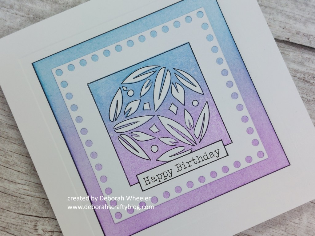
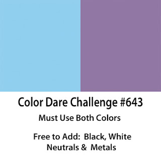
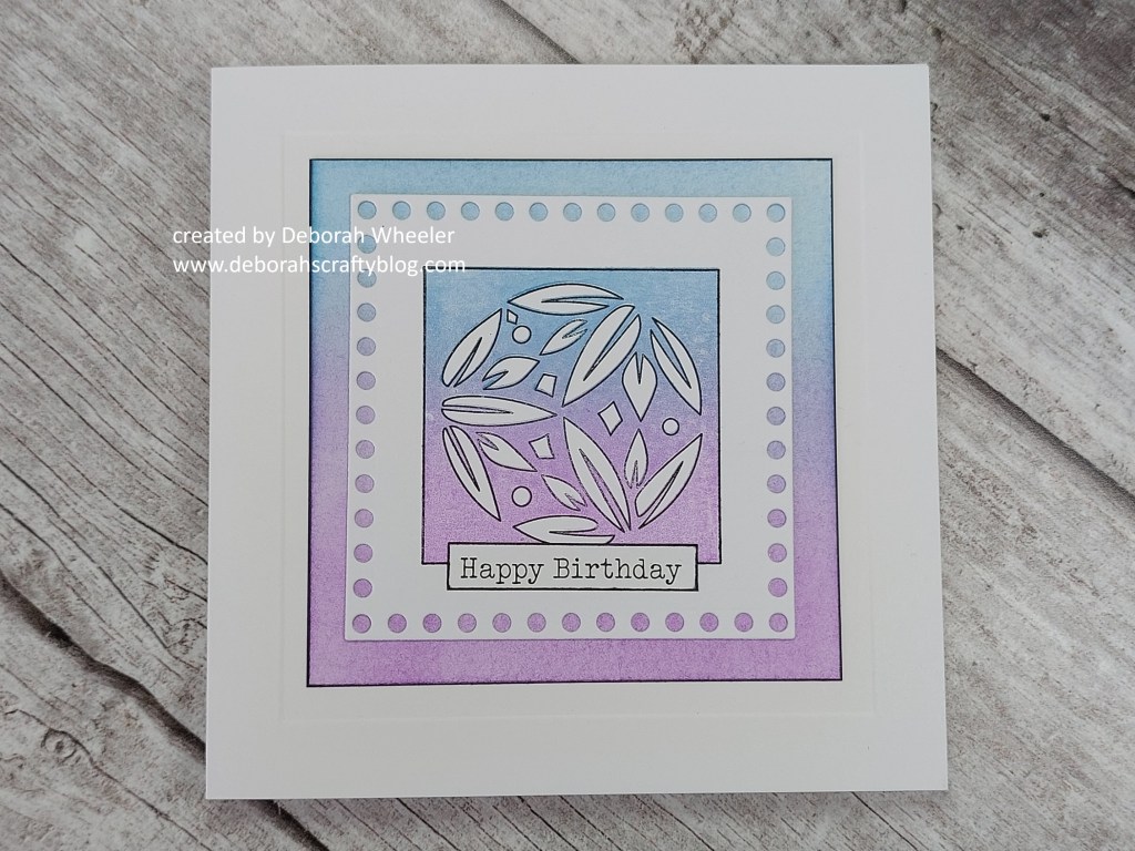
Hello there! I’m late on parade today (it’s been very busy), but didn’t want to miss the chance to give you an early peek of these fabulous ‘Japanese floral tiles‘ stamps that are launching from Clarity Crafts tomorrow – Barbara will be on Clarity Social TV with them at 10am & 2pm. They play perfectly to my CAS heart and I picked up the two tones from Color Dare for this little card using the waterlily tile.
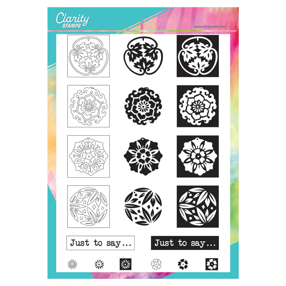
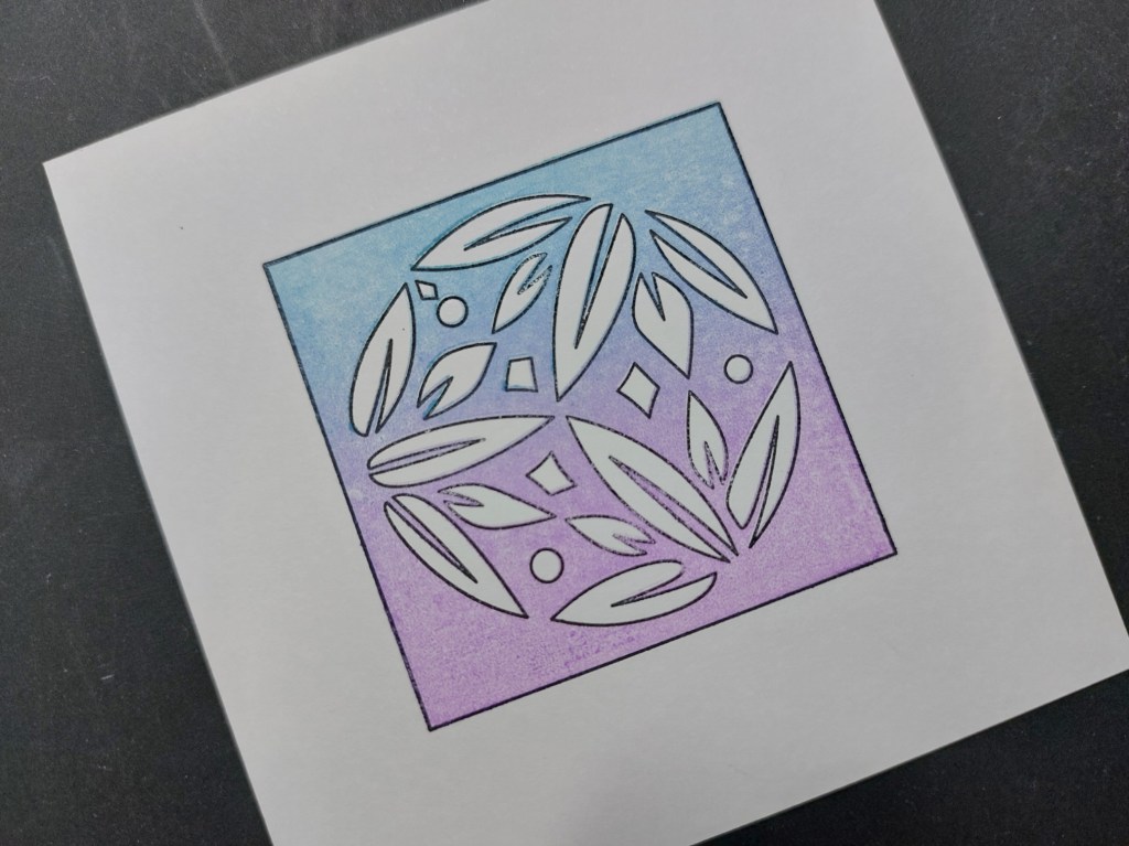
These are three-way overlay stamps, but I’ve just used two of them on this card – the outline and the background infill (the other stamp adds colour to the image). I stamped the outline onto a small square of stencil card using black Archival ink, then brayered the background stamp with ‘broken china’ & ‘wilted violet’ Distress Oxides to add the colour. I cut the card down with one of the ‘dots‘ nested doodle frame-it panel dies and then had to make a deicion about a mount. I couldn’t find a paper that I thought worked, so took another small square of stencil card and brayered the inks across it to match the topper.

Having mounted the topper, I edged the backing card with a black Sharpie. I used a square embedder to emboss a frame onto the front of a 5×5 card blank, attached the topper and finished with one of the ‘Christmas & Celebrations‘ word stickers.
So don’t miss these new goodies tomorrow – there’s three sets of stamps and some brand new collage papers too. And to tempt you in further, it’s still Japan month at Clarity, so there’s an additional 10% off on their website with the code JAPAN10

Discover more from Deborah's Crafty Blog
Subscribe to get the latest posts sent to your email.

Gorgeous and my favourite colours to boot!
LikeLiked by 1 person
Thanks Johanna x
LikeLiked by 1 person
Deborah, your card is so cute, love the layout!. Thanks for playing along with us at Color Dare.
LikeLiked by 1 person
Love the layout of your card. Thanks for playing along with us at Color Dare.
LikeLiked by 1 person
Lovely colours for this design and gorgeous softness xx
LikeLiked by 1 person
Thanks Lynda
LikeLike
Very pretty, looking forward to seeing these in action. X
LikeLiked by 1 person
Thanks Jackie x
LikeLike
So pretty! Lovely soft color palette!
LikeLiked by 1 person
thanks Leslie x
LikeLiked by 1 person
Wow, the layout is gorgeous! Striking card!
LikeLiked by 1 person
thanks so much Vicki!
LikeLike
That’s a cool stencil and I love how our colours were blended together. Thanks for sharing with us at Colour Dare 🙂
LikeLiked by 1 person
Such a beautiful card! I love how you created the background to work perfectly with this challenge. Thank you for joining us at Color Dare.
LikeLiked by 1 person
Wonderful card, Deborah! Blending the colors works perfectly. You achieved a lovely soft pallet for our color challege. Thank you for sharing with us at Color Dare.
LikeLiked by 1 person
So pretty! I love the look of the ‘dots’ frame around the beautiful water lily tile image. Thank you for sharing at Color Dare.
LikeLiked by 1 person
The blending of the background and the framing of your floral is so pretty… love the soft colors. Thanks for sharing with us at Color Dare.
LikeLiked by 1 person