


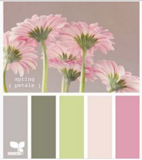
Hello there and welcome to our new theme at Alphabet Challenge! Caz is in charge this time and she’s offered us a moodboard of colour to inspire us for the letter I. Well it struck me as just perfect for one of my favourite ClarityCrafts images – the SHAC ‘peace – Japanese flowers & butterflies’ stamps & stencil set. As well as Alphabet’s colours, I’ve been inspired by the CAS birthday theme at The Paper Players, the circles from CAS on Friday and the stencil week at Just Us Girls


I started with the stencil, attached it to a 6×6 square of stencil card and added a circular mask over the centre, before lightly brushing ‘pumice stone’ Distress Oxide across it (working from the mask outwards) to give me a soft border.
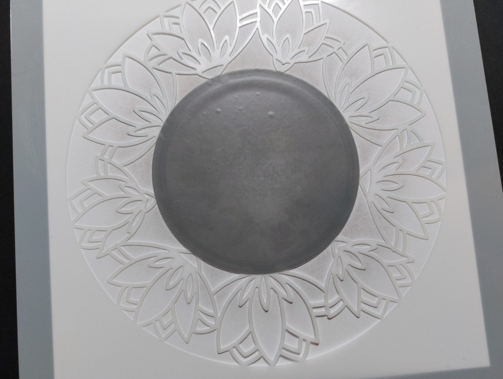
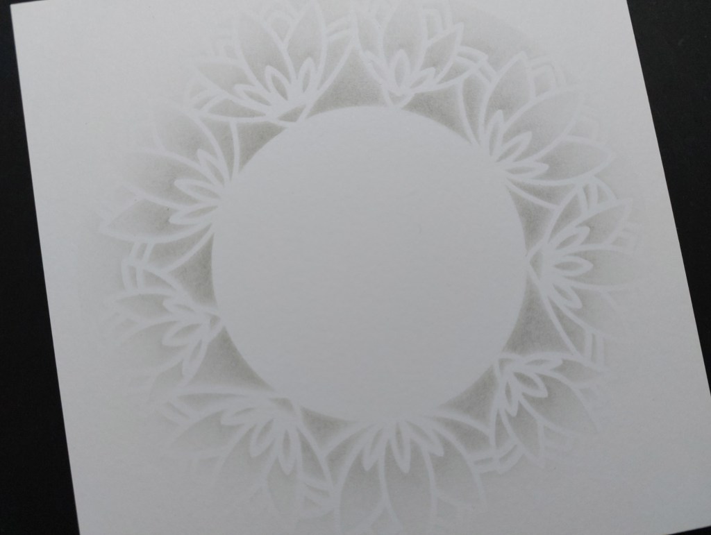
Having removed the stencil & mask, I stamped the outline image into the centre. Now, the sharp-eyed amongst you will have noticed that the image is not sitting exactly in the middle of the stencilled border… rookie error! I should have stamped the image first so that I could then position the stencil accurately around it. Doh! Anyway, I pressed on and shaded the image using pink & green Pergaliner pencils and a grey Polychromo.


I decided to disguise the slightly off-set image with a sentiment, so added a couple of the ‘bijou retro sentiments’ in ‘watering can Archival ink before layering the topper onto a piece of grey card and attaching it to a 7×7 card blank.

So, how are you inspired by our lovely colour palette? Come on over and share your creations with us at Alphabet – we can’t wait to see them in our gallery!
Discover more from Deborah's Crafty Blog
Subscribe to get the latest posts sent to your email.

Love that circular stencil, great way to frame the pretty colored image!
LikeLiked by 1 person
Absolutely perfect!
LikeLiked by 1 person
Thank you!
LikeLiked by 1 person
Love the way the stencilling highlights the central image Deborah – so effective. Thanks for playing along with my CAS birthday challenge over at the Paper Players this week!
LikeLiked by 1 person
Thanks so much Joanne x
LikeLike
So pretty with delicate and soft colours.
LikeLiked by 1 person
Thank you Johanna x
LikeLiked by 1 person
So pretty and that framing stencil looks so delicate x
LikeLiked by 1 person
Thanks Catherine – I just wanted a soft edge to it
LikeLike
Wow, this is so lovely! The soft stencilling around the outside enhances the beauty of the inner circle. Thank you for joining us at The Paper Players this week. 🙂
LikeLiked by 1 person
Thanks so much Jan!
LikeLike
Deborah… pumice stone! Brilliant. Love your soft background. I would never have notice the medallion was off center if you hadn’t told me. Such a wonderful design! Thanks so much for joining and sharing with Just Us Girls and the Paper Players this week.
LikeLiked by 1 person
Wowzer, this is so elegant!
LikeLiked by 1 person
Thank you Vicki! I do love this stamp set!
LikeLike
This is absolutely gotgeous. I love that circular stencil and your soft hand with that lovely ink. Love the colors you used for the stamped image. I did not notice that it was placed a little off until I read your post. It is a beautiful card. Thanks for sharing it with us at Just Us Girls.
LikeLiked by 1 person