

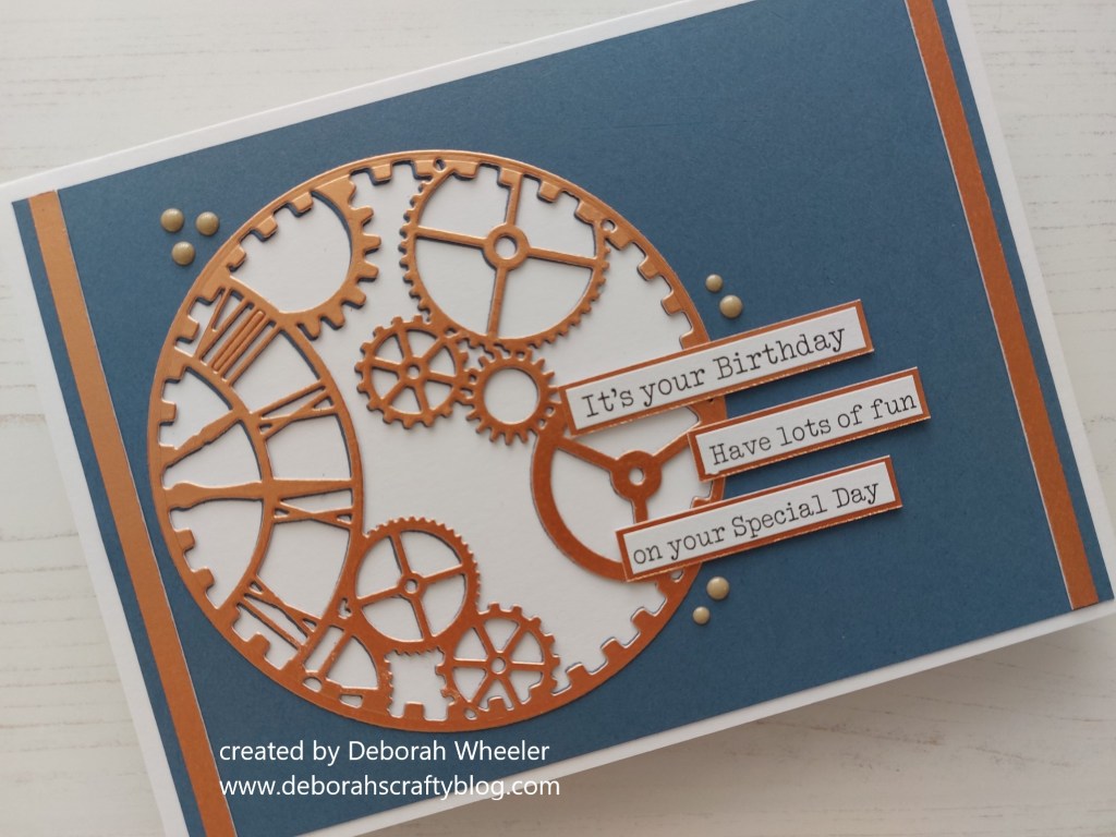
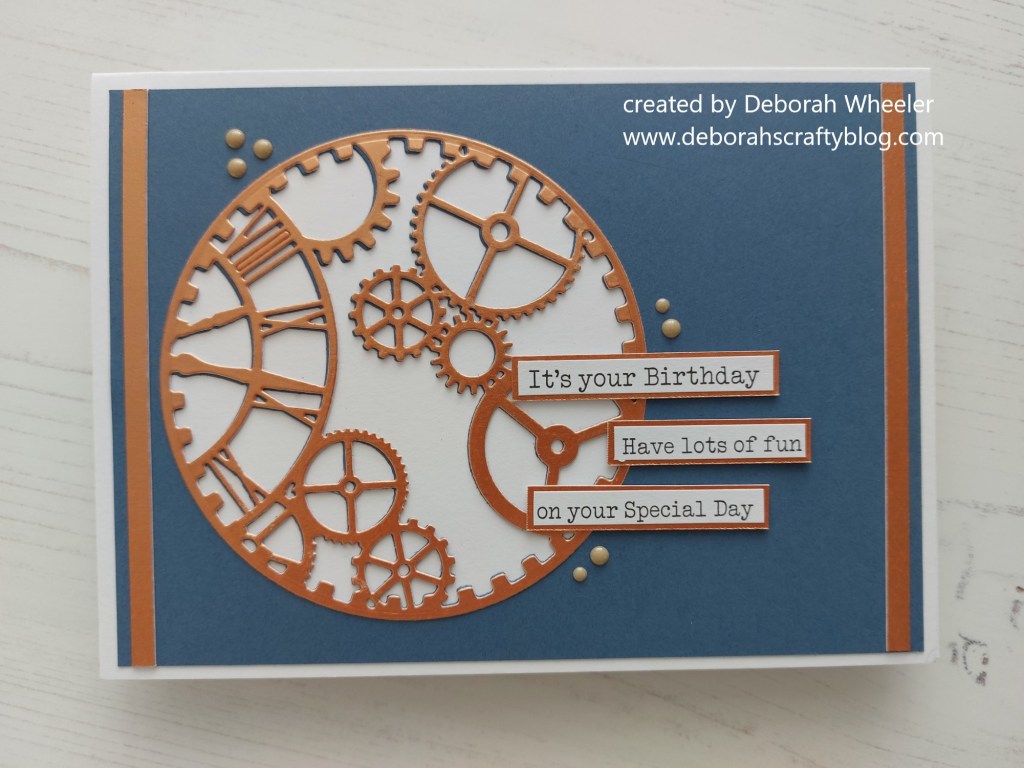
Welcome to my second post today, this time with the new colour challenge from As You See It. I thought this palette would work really well for a masculine card, with ClarityCrafts ‘clockwork’ aperture die and the sketch from Global Design Project


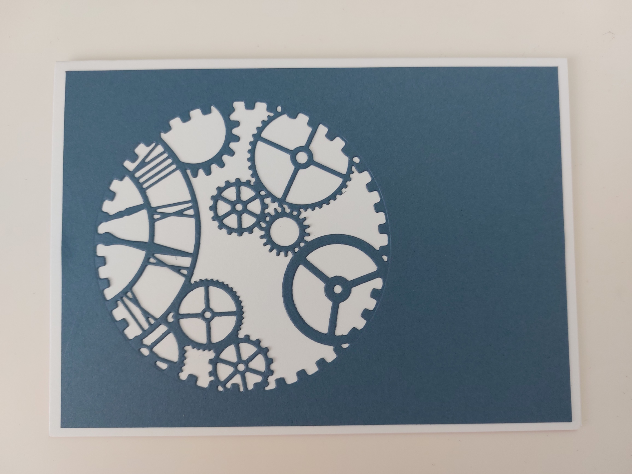
I started with a piece of navy card, trimmed fit on a 5×7 card blank, and cut the ‘clockwork’ aperture die into it. For one, I’d remembered to put a layer of thin adhesive sheet on the back, so was then able to easily attach it to the front of the card blank. I then cut the die again into a piece of copper metallic card (again with an adhesive sheet on the back), cut it out with a nested circle die and attached it on top of the navy layer, offsetting it very slightly to give a drop shadow effect.

I added a strip of the copper metallic card down each side of the card, then mounted word sticker on the copper card and added them to the card front. The finishing touch was a few beige enamel dots in around the die cut.
So how would you use our colours? There’s more inspiration from my design team-mates over at As You See It and you have until Wednesday 18 October to join in with us – we’d love to see you in our gallery.
Discover more from Deborah's Crafty Blog
Subscribe to get the latest posts sent to your email.

GREAT masculine card! Love those colors, too!
LikeLiked by 1 person
Thanks!
LikeLike
Such a cool card with the gears and clockwork!
LikeLiked by 1 person
Thank you!
LikeLike
Wow, Deborah, LOVE those dies! This design is amazing, those gears are super cool, and it all looks fabulous in our colors, too! Perfect little details, too!
LikeLiked by 1 person
Thanks so much Heather! xx
LikeLike
That die is so great – I’ve seen you use it before I think – and I love it. Perfect steampunk and a great take on the colours.
LikeLiked by 1 person
Thanks so much Jan – it is a favourite die when I need mens cards!!
LikeLike
This is a fabulous masculine card Deborah – the detail of copper cogs is so eye-catching against the blue. A must for steampunk fans too!
LikeLiked by 1 person
Thanks Joanne x
LikeLike